Capstone
Project Overview
To address the challenges of secondhand market online shopping, I designed HypeHunt, an iOS app that provides the necessary information to build users’ trust and peace of mind, offering them reliable sellers and authentic products.
HypeHunt provides users with high-quality images and detailed product descriptions, verified reviews of products and resellers, and a two-step authentication process - everything handy in a compassion feature, carefully thought to create a trustworthy secondhand market platform.
Project Length: 10 weeks
My role: End-to-end UX/UI Designer
Tools Used: Figma, FigJam, Slack, Zoom, Otter.ai, StorySet
OS: iOS
Methodology
For this design challenge, I adopted the non-linear Design Thinking Process, placing the end-user at the heart of all decisions. This approach helps tackle complex, undefined problems with the ultimate goal of creating a solution that fits the users’ needs, developing usable, useful, enjoyable, and equitable solutions.
Problem Space
Many companies are now looking to tap into the $24 billion secondhand market, and it’s easy to see why.
As secondhand fashion gains more consumer traction, digital resellers have emerged in noticeable numbers.
In the U.S., the secondhand market for exclusive items has found a fervent following among Millennials, blending luxury
with sustainability.
Secondhand goods are often cheaper than their new matches, and there’s a growing consumer preference for a few
specific market characteristics, like environmental and economic factors, price, sustainability benefits, and the thrill
of "hunting" for unique items.
Problem Statement
According to a 2023 Statista survey, 39% of millennials were interested in secondhand shopping. Additional research shows that Millennial shoppers value the secondhand market’s uniqueness and environmental benefits, but they still struggle with obstacles such as educational gaps, societal stigma, and concerns over quality, selection, sizing, and authenticity when it comes to the online shopping experience in this market.
Secondary Reserach
I conducted a round of Secondary Research and collected some data to identify gaps in existing research related to the subject, trying to better understand the contrasting numbers from this exponentially growing market.
Preliminary HMW
Based on my secondary research, I had one question that I was willing to answer:
“How might we help Millennial shoppers feel confident when purchasing in the online secondhand market?"
Assumptions
Given what I've read and heard about the topic, I've made a few assumptions:
1- I believe shopping online in the secondhand market can be overwhelming because of the amount of results
2- I believe secondhand online shoppers are extremely concerned about product authenticity
3- I believe Millennials are willing to buy more in the secondhand market because of environmental reasons
4- I believe shopping online in the secondhand market can be overwhelming because of the randomness of resellers
5- I believe online shoppers miss precise product information when it comes to secondhand market
6- I believe Millennial shoppers are interested in luxury items sold in the secondhand market
7- I believe the secondhand market online shoppers always check reviews from previous buyers when trying to avoid a scam
8- I believe it's difficult for consumers to understand their rights in so many random secondhand market platforms
Hypothesis Statement
I analyzed my assumptions, and identified my Hypothesis Statement:
"I believe online shoppers miss precise product information when it comes to the secondhand market. I will know I'm right when I see the following feedback from my interviewees: At least 2 out of 3 of my interviewees mention things like, 'I miss a good product description', 'product information is weak' or 'product details can be inconsistent'."
Research Objectives
I establish my research objectives: investigate why Millennials still struggle with obstacles such as educational gaps, societal stigma, and concerns over quality, selection, sizing, and authenticity when it comes to the online shopping experience in this market.
It seemed relevant to investigate how consumers face the topic: are there prejudices? What are the challenges? What are their interests? What are they missing?
Primary Research
I used the Interview method to gather more information about the Secondhand Market.
I wanted to understand people's needs, goals, motivations, and pain points when it comes to their personal experiences regarding the subject, and that's why this Qualitative Method was the best option for me to conduct my primary research. Interview is a decontextualized method, that allows the researcher to meet with participants one-on-one to discuss in depth what interviewees think about the topic in question.
-
I interviewed 3 people through "Zoom".
Pamela and Icaro's interviews took around 55 minutes each. Evandro's interview took around 45 minutes.
In order to better connect with my interviewees and ask patterned questions, I came up with a guide, including a few "warm-up questions", followed by 32 questions related to the main topic. When possible, I added follow-up questions to better understand their answers. Also, I tried to keep the interviews as friendly as possible, always giving space and opportunities for the interviewees to share their thoughts and experiences without hesitation, never expressing my personal opinion.
Participants Criteria
Given the data collected on the secondary research, I understand that Millennials are significant contributors to the rise of the secondhand market for several reasons.
Considering the above, I established the following criteria:
-
Economic factors, environmental awareness, search for uniqueness and authenticity, community and social factors, convenience, and accessibility, are some of the reasons why Millennials are fueling the growth of the secondhand market, aligning both their economic interests and their values around sustainability, technology, and individuality.
-
I decided to focus on active online shoppers, so that I can really open space for those who are experiencing the situation, and not just wondering about it.
Key Findings
As I was conducting the interviews, I noticed a lot of common patterns in their answers.
Even though the interviewees had different life experiences, interests in the secondhand market, and approaches when it comes to online shopping, they all mentioned things like:
1- Identifying the authenticity of products can be tricky
2- Reviews play a big role when it comes to identifying reliable resellers
3- It can be hard to find high-quality images and well-written product descriptions
4- There are countless random resellers out there, so it's hard to identify the reliable one
5- Navigating through the secondhand market can be time-consuming
Affinity Mapping
I started checking the interview files to collect quotes.
It was a process full of empathy because I wanted to understand everything the interviewees told me 'through' and 'beyond' their words.
I created dozens of sticky notes. I gave participants colors and identified their initials.
Then, I reorganized all the sticky notes into three different categories: Pain Points (red), Goals and Motivations (blue), and Behaviors (yellow). Part of this process is here:
It's important to say this was not a linear process for me. I had to take a few steps back when I was already working with my Epics and Users Stories, to revisit my Affinity Mapping, Persona, and Experience Mapping.
I realized that because my users were very clear about their frustrations, goals, motivations, behaviors, and, mainly, needs, I ended up building an initial solution-oriented Affinity Mapping, that also affected my initial Persona and Experience Mapping - which is, definitely, something that I don't want to do as a designer.
So I pivoted in my approach to these three important pieces of my project, keeping my mind open and free of biases. I let the interviews be more than “established solutions"; I let them be “shared experiences and points of view” that could help me understand different design opportunities later in the process.
If you want to check the final Affinity Mapping, you can click here.
Themes
Last but not least, I reorganized the sticky notes once more.
This time, I identified 5 themes that were mentioned in all three interviews. Each theme has its own insight and collects pain points, goals and motivations, and behaviors. Let's check it:
-
Shoppers like the exclusivity of unique, limited items that can be found in the secondhand market
-
Authenticity is a major concern for consumers in the secondhand market. The inability to personally verify the authenticity of items and the fear of falling victim to scams deter many online shoppers from making purchases.
-
The overwhelming number of advertisements across multiple platforms makes it challenging for online shoppers to find reliable resellers, due to inconsistent information and unclear policies for resolving disputes. Reviews are crucial in assisting shoppers to navigate through sellers and identify reliable advertisements.
-
Online shoppers are drawn to communities to exchange information, acquire knowledge, receive and offer advice, engage in discussions about specific market segments, and share their accomplishments.
-
Online shoppers prioritize receiving thorough and accurate product information. They expect resellers to focus on providing detailed descriptions, high-quality images, precise measurements, and comprehensive details about the condition of the products.
Chosen Theme
Trust and Verification
Considering the insights from the "Trust and Verification" theme analysis, I've selected it as the focal theme for the Persona development.
The insights from Affinity Mapping interviews highlight "Trust and Verification" as a significant concern for all participants. They expressed difficulties in sorting through numerous ads on various platforms, making it hard to find trustworthy resellers. This problem is exacerbated by inconsistent information and unclear policies for resolving disputes, complicating the task of comparing data from different sources.
Additionally, the importance of reviews in navigating this complex marketplace was emphasized, helping shoppers identify credible sellers and authentic ads. The connection between "Trust and Verification" with "Communication" and "Authenticity" emphasizes a broader issue: despite the plethora of information online, clear and reliable product details are often lacking.
Revised HMW
After concluding the process above, I took a moment to revisit my initial "How Might We" question.
Was there a better way to address the pain points, goals, motivations, and behaviors that my interviewees were facing when thinking about their online experience in the secondhand market?
And my refined HMW question came to be:
"How might we help Millennials online shoppers build their trust and easily navigate the secondhand market?”
Persona
This meticulous and empathetic process brought my Persona alive. Let’s meet Alex.
Experience Mapping
Considering Alex's pain points, behaviors, goals and motivations, I created an Experience Mapping and analyzed the overview of his online shopping experience in the secondhand market.
I identified 4 different solution opportunities:
1- Help online shoppers to find trustworthy resellers
2- Facilitate the comparison between ads
3- Provide verified reviews, detailed information on products, and clear policies on dispute resolutions
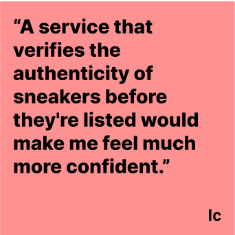
4- Offer a pre-checked authenticity service
User Stories and Epics
With my persona well-defined and considering my Experience Mapping, I started thinking about the User Stories.
The idea here was to understand the possible functional needs of my Persona.
I created 30 User Stories and identified 3 Epics:
-
1- As a Millennial online shopper willing to dive into the secondhand market, I want to access a platform where I can find exclusive sneakers from verified resellers, so that I can trust the authenticity and quality of my purchases.
2- As a Millennial online shopper willing to dive into the secondhand market, I want to read detailed and verified reviews about products and resellers, so that I can make informed decisions before purchasing.
3- As a Millennial online shopper willing to dive into the secondhand market, I want to view high-quality images of the products, so that I can thoroughly inspect the item before buying.
4- As a Millennial willing to dive into the secondhand market, I want to have access to clear and complete descriptions of the products, so that I can learn about details that might affect my shopping decision.
5- As a Millennial online shopper willing to dive into the secondhand market, I want to find detailed condition information for each exclusive product, so that I know exactly what I'm buying.
6- As a Millennial online shopper willing to dive into the secondhand market, I want clear policies on dispute resolution, so that I know what steps to take if an issue arises.
7- As a Millennial online shopper willing to dive into the secondhand market I want consistent and clear information across advertisements, so that I can make comparisons more easily.
8- As a Millennial online shopper willing to dive into the secondhand market, I want to see a seller's transaction history and ratings, so that I can gauge their reliability.
9- As a Millennial online shopper willing to dive into the secondhand market, I want a system that flags or removes listings with inconsistent information, so that I can browse with confidence.
10- As a Millennial online shopper willing to dive into the secondhand market, I want to have access to a well-established authentication process, so that I can be assured of the authenticity of the products.
11- As a Millennial online shopper willing to dive into the secondhand market, I want to easily contact resellers for simple chats or questions, so that I can get more information directly from them.
12- As a Millennial online shopper willing to dive into the secondhand market, I want to be able to trust the platform's authenticity guarantee, so that I can be confident in my purchases.
13- As a Millennial online shopper willing to dive into the secondhand market, I want a platform that supports secure payment methods, so that I can complete transactions safely.
-
1- As a Millennial online shopper willing to dive into the secondhand market, I want to join a community where I can share and learn about sneaker fashion tips and experiences, so that I can enhance my knowledge and collection.
2- As a Millennial online shopper willing to dive into the secondhand market, I want to access educational content about specific categories and collecting to become a more knowledgeable collector.
3- As a Millennial online shopper willing to dive into the secondhand market, I want to participate in forums or discussion groups about sneakers, so that I can engage with the community and share my passion.
4- As a Millennial online shopper willing to dive into the secondhand market, I want to know about the latest trends and releases of specific categories, so that I can stay updated and possibly find rare items for my collection.
5- As a Millennial online shopper willing to dive into the secondhand market, I want to learn about the history and significance of different styles, so that I can appreciate my collection even more.
6- As a Millennial online shopper willing to dive into the secondhand market, I want to be able to easily share my purchases and experiences on a platform community, so that I can connect with others and showcase my collection.
-
1- As a Millennial online shopper willing to dive into the secondhand market, I want to use advanced filters to quickly find the sneakers I'm interested in, so that I can save time and find exactly what I'm looking for.
2- As a Millennial online shopper willing to dive into the secondhand market, I want to receive notifications about new arrivals in my favorite categories, so that I don't miss out on potential additions to my collection.
3- As a Millennial online shopper willing to dive into the secondhand market, I want to have a wishlist feature to save products I'm interested in, so that I can keep track of them and decide later.
4- As a Millennial online shopper willing to dive into the secondhand market, I want to be able to sort products by price, popularity, and newness, so that I can easily find what suits my preferences and budget.
5- As a Millennial online shopper willing to dive into the secondhand market, I want to receive personalized recommendations based on my search history and preferences, so that I can discover new sneakers that I might like.
6- As a Millennial online shopper willing to dive into the secondhand market, I want to access customer service easily through chat, email, or phone, so that I can get help whenever I need it.
7- As a Millennial online shopper willing to dive into the secondhand market, I want to have access to exclusive deals and promotions, so that I can add to my collection without overspending.
8- As a Millennial online shopper willing to dive into the secondhand market, I want to receive alerts on price drops for items on my wishlist, so that I can make timely purchases at the best price.
9- As a Millennial online shopper willing to dive into the secondhand market, I want to compare prices and conditions from different sellers in one view, so that I can choose the best deal.
10- As a Millennial online shopper willing to dive into the secondhand market, I want to be able to set up notifications for restocks of previously sold-out items, so that I don't miss a second chance at a rare find.
11- As a Millennial online shopper willing to dive into the secondhand market, I want to be able to track the shipment of my purchases, so that I can know when to expect my new sneakers.
Chosen Epic
Trust and Verification
After revisiting my Persona and checking out the User Stories developed, I noticed that there was one Epic that better expresses the majority of functional needs that could be addressed in my project.
The User Stories in the Epic "Trust and Verification" clearly represent how important it is for my Persona to build trust in resellers when purchasing online in the secondhand market.
So "Trust and Verification" is the chosen Epic for this project.
Task Flow and Chosen User Story
I revisited my chosen Epic and selected one User Story that became the foundation for my Task Flow.
The chosen User Story for the Task Flow is the following:
"As a Millennial online shopper willing to dive into the secondhand market I want consistent and clear information across advertisements so that I can make comparisons more easily.
-
1- "As a Millennial willing to dive into the secondhand market, I want to read detailed and verified reviews about products and resellers, so that I can make informed decisions before purchasing."
2- "As a Millennial who is willing to dive into the secondhand market, I want to view high-quality images of the products, so that I can thoroughly inspect the item before buying."
3- "As a Millennial who is willing to dive into the secondhand market, I want to have access to clear and complete descriptions of the products, so that I can learn about details that might affect my shopping decision."
4- "As a Millennial who is willing to dive into the secondhand market, I want to see a reseller's rating and history, so that I can evaluate their credibility and reliability."
Link to the file hereUI Inspiration Board and Sketches
After concluding the "Define” phase and better understanding my Persona's needs, it was time to start ideating.
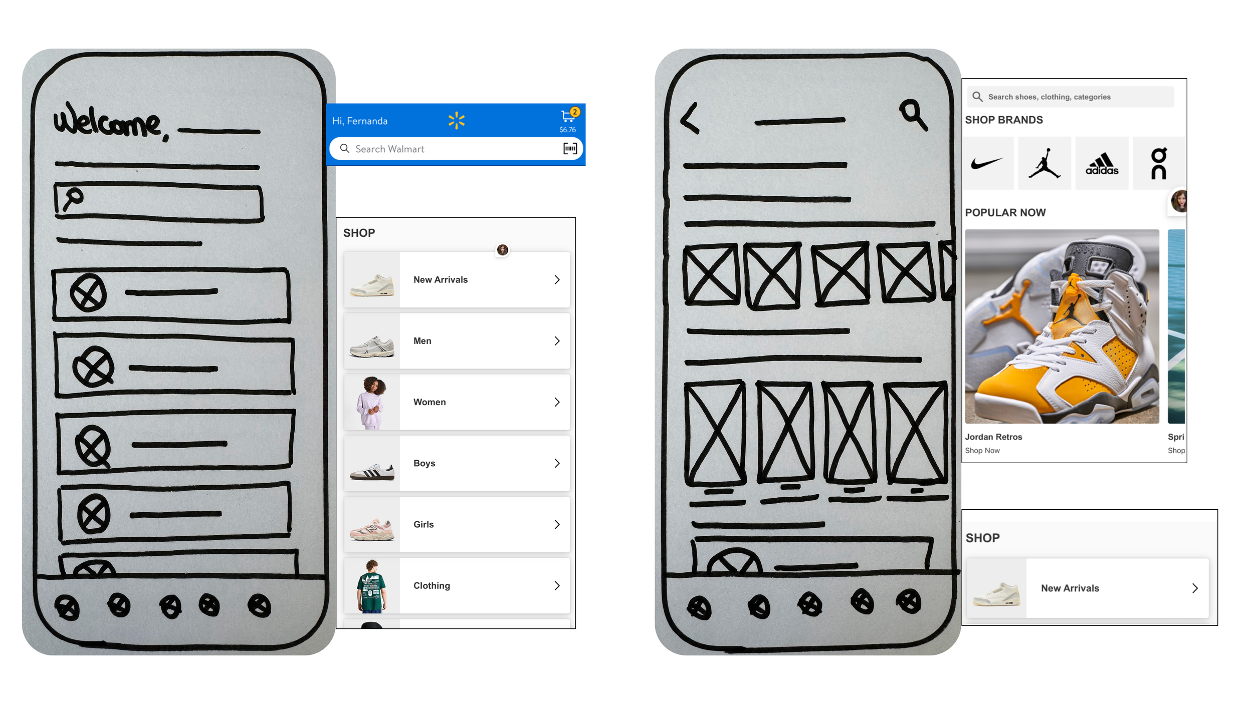
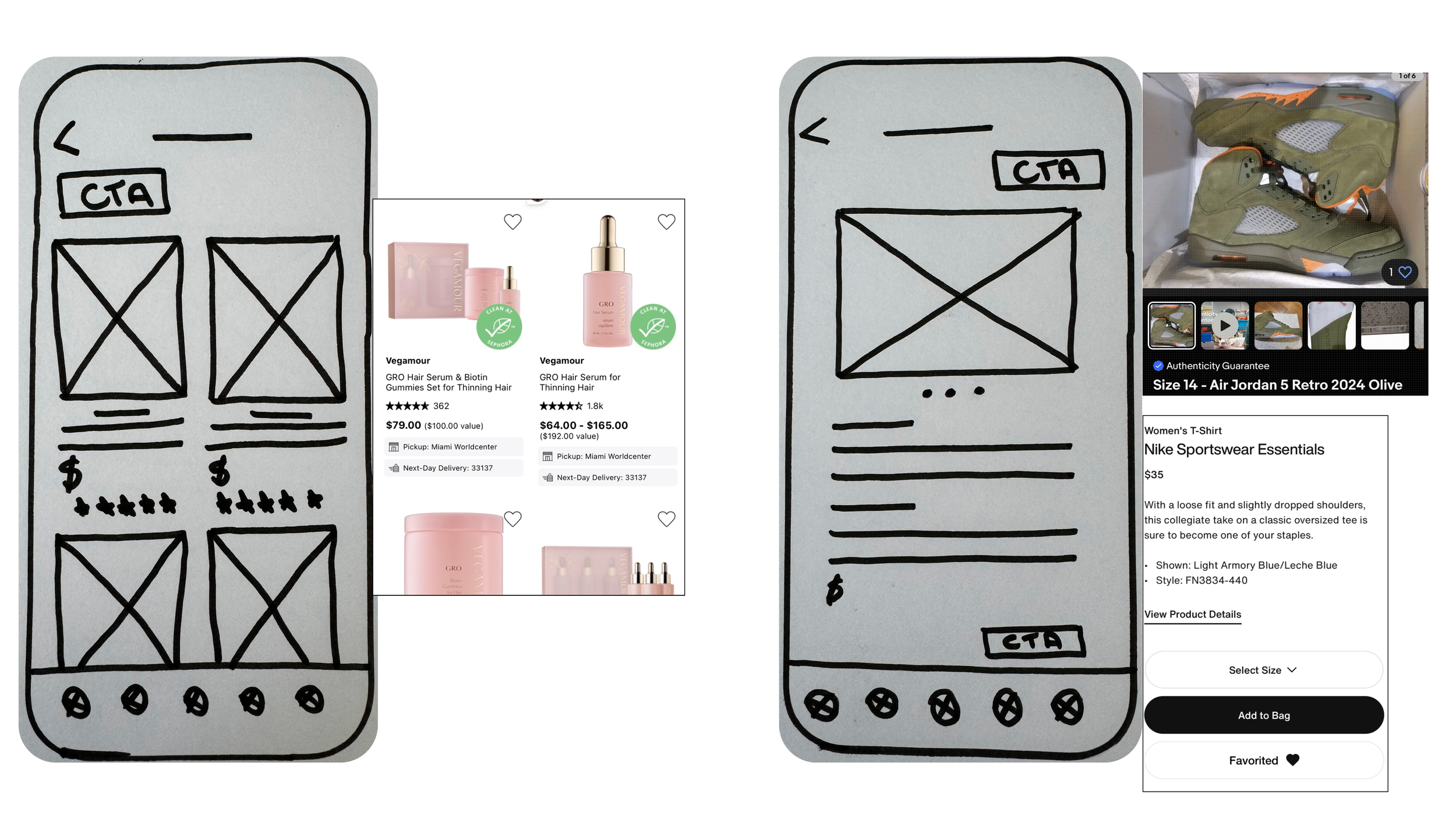
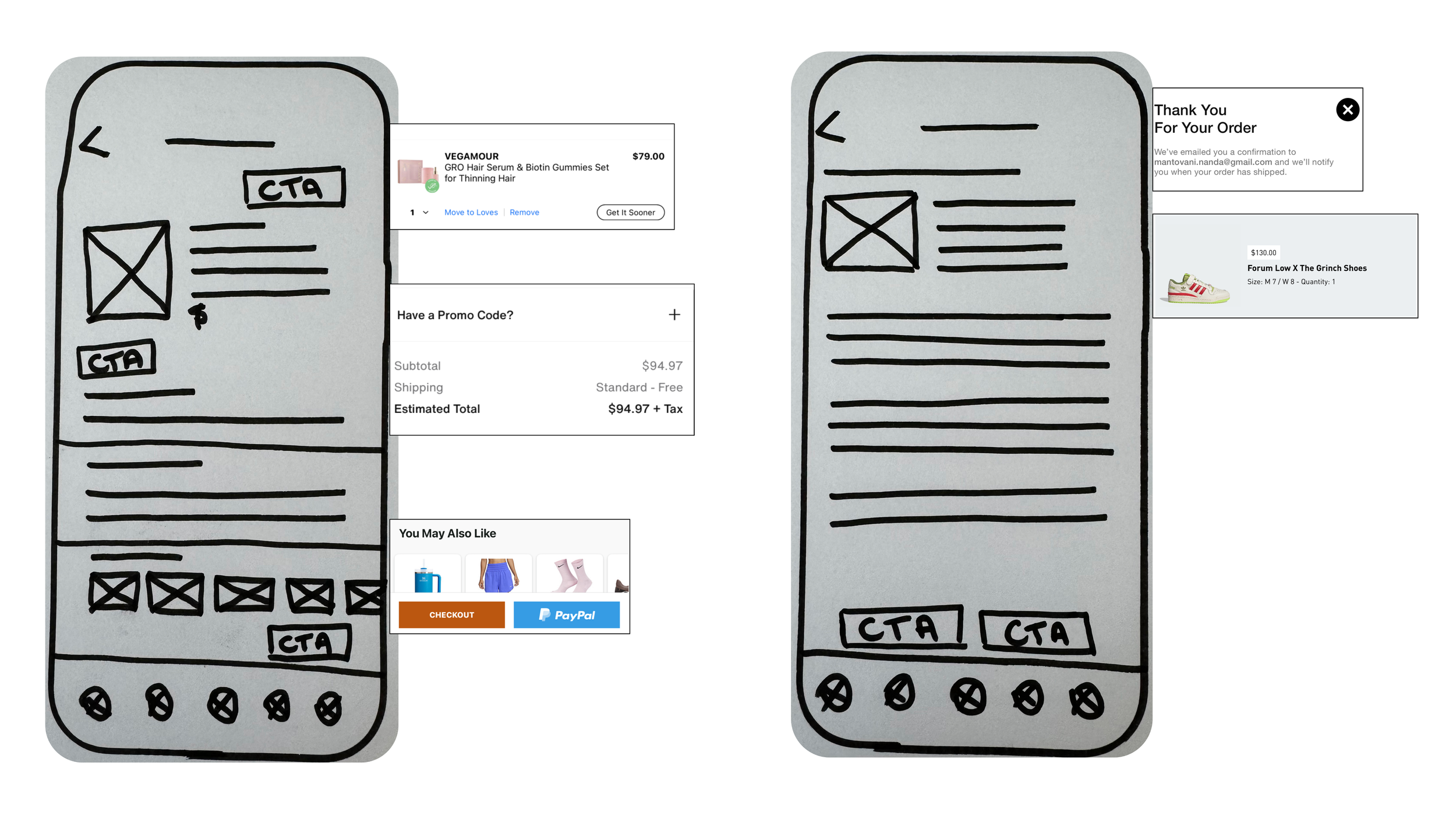
I collected ideas for UI elements in my Inspiration Board that would be most useful for users to accomplish their tasks effectively while using my app.
From my UI Inspiration Board, I identified the ideas I believed could provide the best experience for my target audience and started sketching.
You can access my UI Inspiration Board here.
Typography and Grayscale
After identifying my solution sketches, it was time for me to start working on my Wireframes.
I started defining my grayscale palette and the design typography, which I'd eventually revise in my Hi-Fi prototype.
I wanted to use Roboto and DM Sans because together they create a flexible font pair that works in almost any story. DM Sans is a versatile sans-serif font with multiple styles and weights. The letterforms g, e, i, and f in DM Sans give it a lot of character, making it a great typeface for a playfully modern theme - which is something I wanted to bring to my app. Roboto has a dual nature, with a mechanical skeleton and largely geometric forms, while also featuring friendly and open curves, which can improve reading.
Mid-Fi Wireframes
I built my Mid-Fi Wireframes focused on keeping the essence of my Solution Sketches and my users front and center.
You can check my Mid-Fi Prototype here.
-
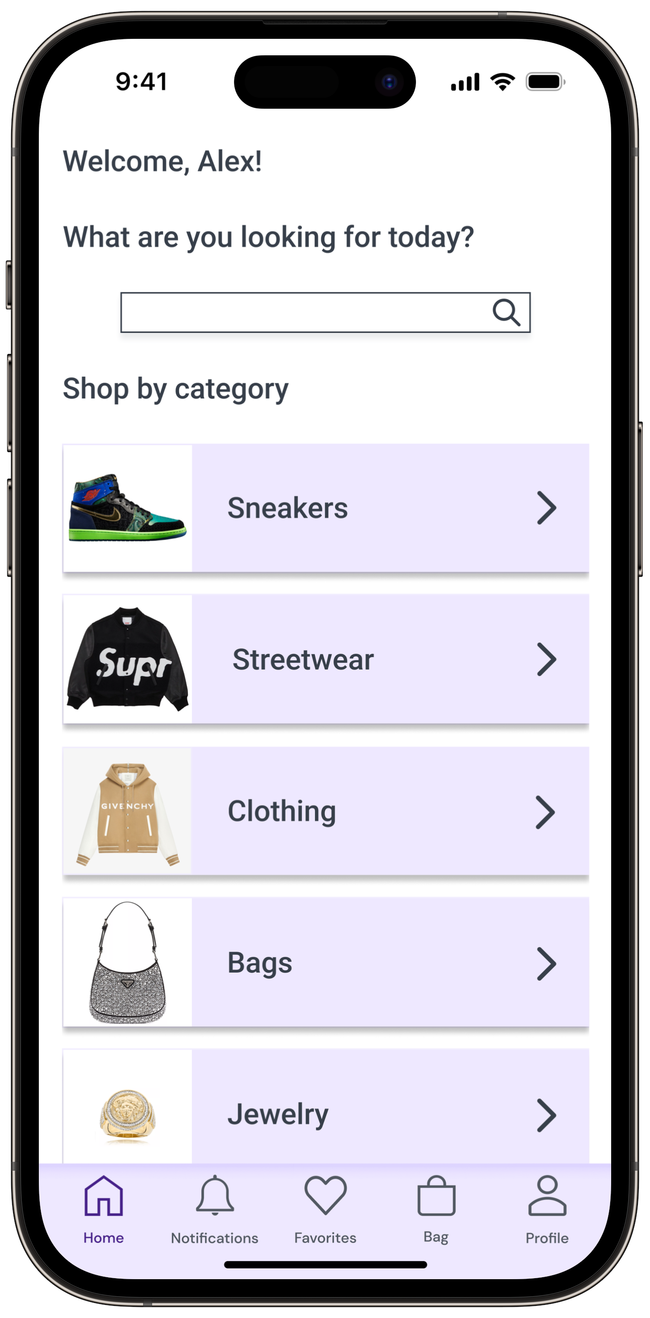
Where the user lands after opening the app (already logged in). We can see the "Search Bar" at the top (allowing the user to search for a specific item, which is common in the secondhand market), followed by a scrollable list of categories.
-
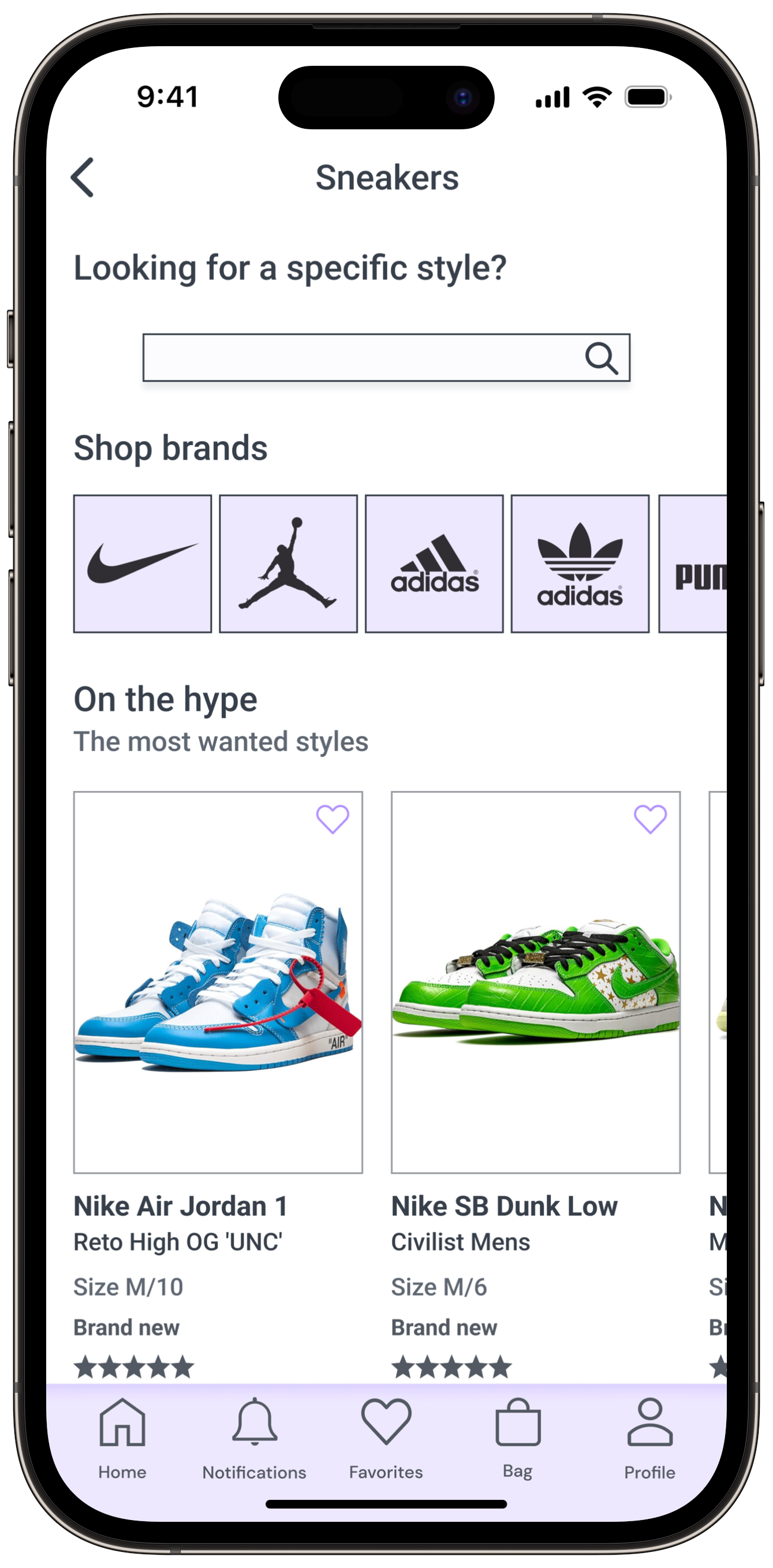
Home screen of the Sneakers section. We can see the "Search" bar at the top (allowing the user to search for a specific style, which is common in the secondhand market), followed by the "What's on the Hype" section. Finally, there's a scrollable list of categories.
-
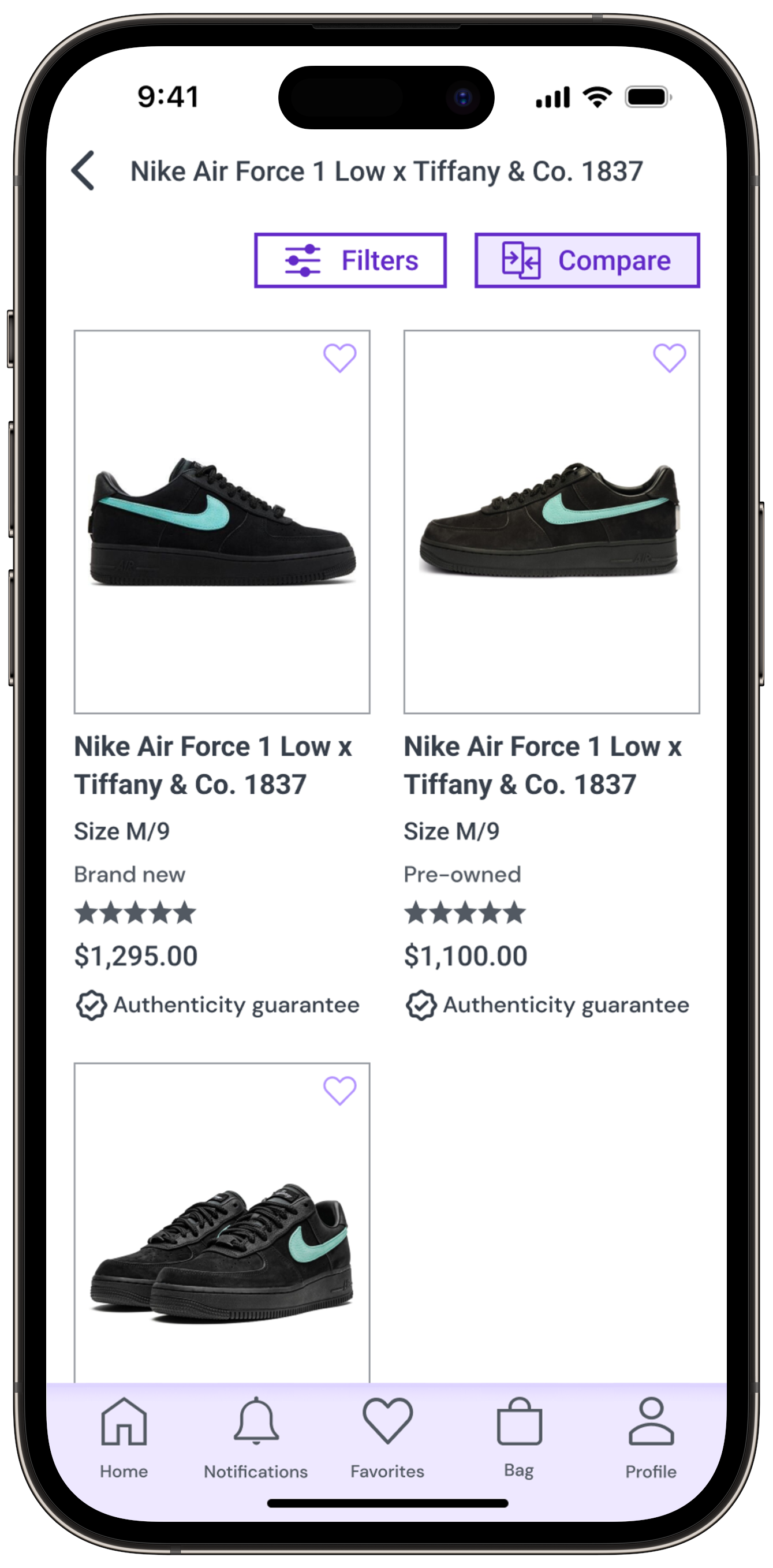
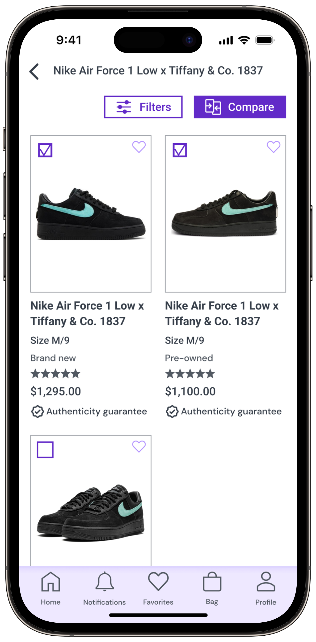
Here, the user visualizes all the available products according to their search.
-
This is the screen where the user can access all product images and information (description, current conditions, general rating). Also, the user can check the seller's reputation (rating stars and reviews provided by verified buyers in the app).
-
Here, the user can visualize an overview of the product(s) selected, as well as information about the shipping costs, the option for adding a "Promo Code", an "estimated total" and a carousel of products that they might want to see before proceeding to the checkout.
-
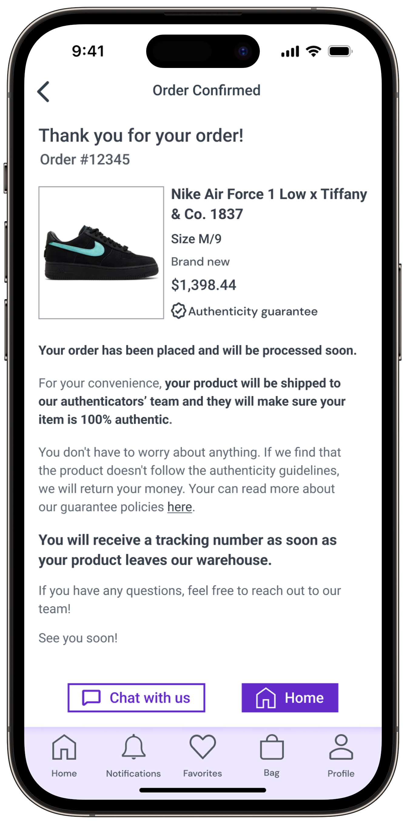
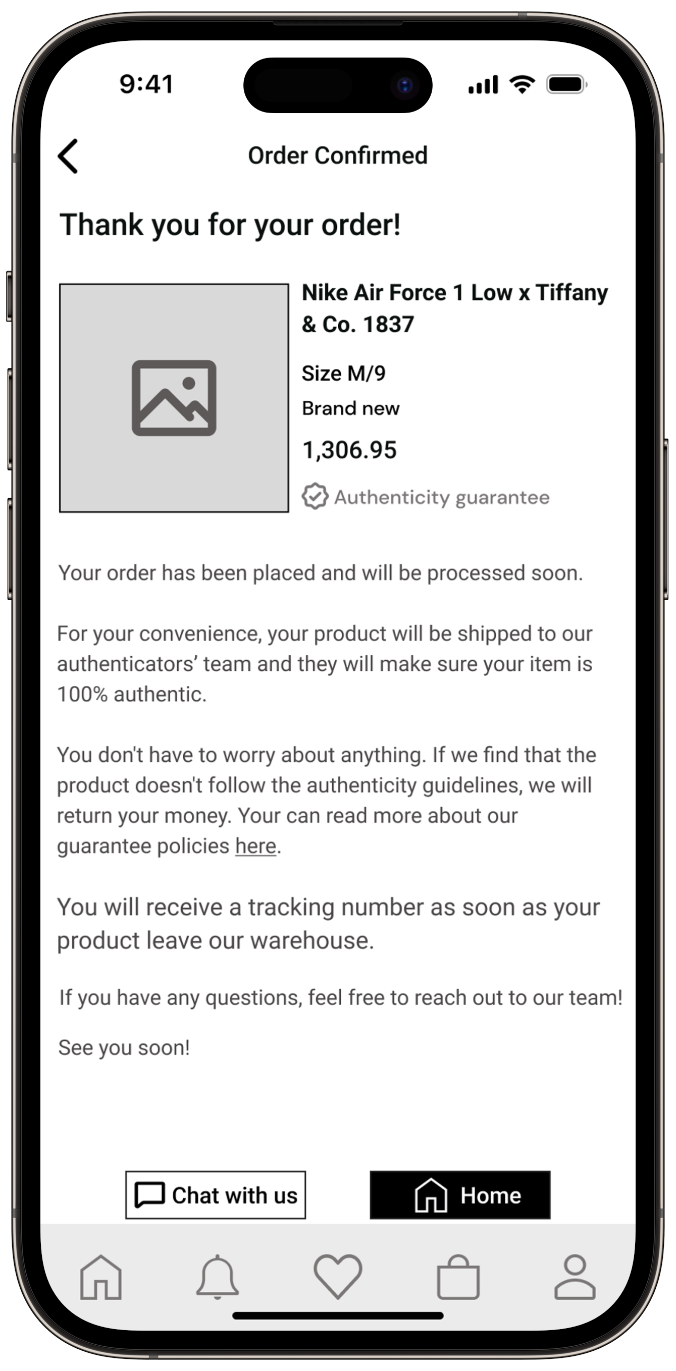
After proceeding to the checkout and completing the payment process, the user is taken to this screen, where they can see a summary of their order, as well as information about the authenticity verification process and shipping.
Usability Testing Plan
Wireframes ready, it was time to set up the prototype and prepare the Usability Testing Plan. The idea was to understand how users would complete the tasks when using the designed application.
Knowing the importance of improving the app's design to enhance the user experience, I conducted 10 user tests, in 2 different rounds of 5 different sessions each. Each one of the 10 sessions took place on "Google Meeting" and lasted between 15 and 20 minutes.
-
-Goal: Compare between ads and buy a pair of "Nike Air Force 1 x Tiffany & CO" sneakers in size M/9
-TASK 1: Access "Sneakers" section]
-TASK 2: Search specific sneaker: Nike -Air Force 1 x Tiffany & CO (type "Ti")]
-TASK 3: Compare ads]
-TASK 4: Choose your sneakers and add them to the shopping bag
-TASK 5: Checkout] [TASK 6: Complete transaction with Apple Pay
Session Output and
Prioritization Matrix
Round 1
I conducted the first round of tests on my prototype Version 1.
The results were consistent in all 5 tests: users found the app easy to use, straightforward, and with minor issues.
The following is the most noteworthy issue mentioned across the tests:
Two users mentioned that the "compare" button on the "Results Screen" could be a little bit darker, to catch even more their attention.
Based on my session output, I worked on my Prioritization Matrix for round 1. Let's take a look:
Revisions - V1 x V2
Now, let's check the revisions made according to the Prioritization Matrix V1 x V2:
Before (V1)
After (V2)
Before (V1)
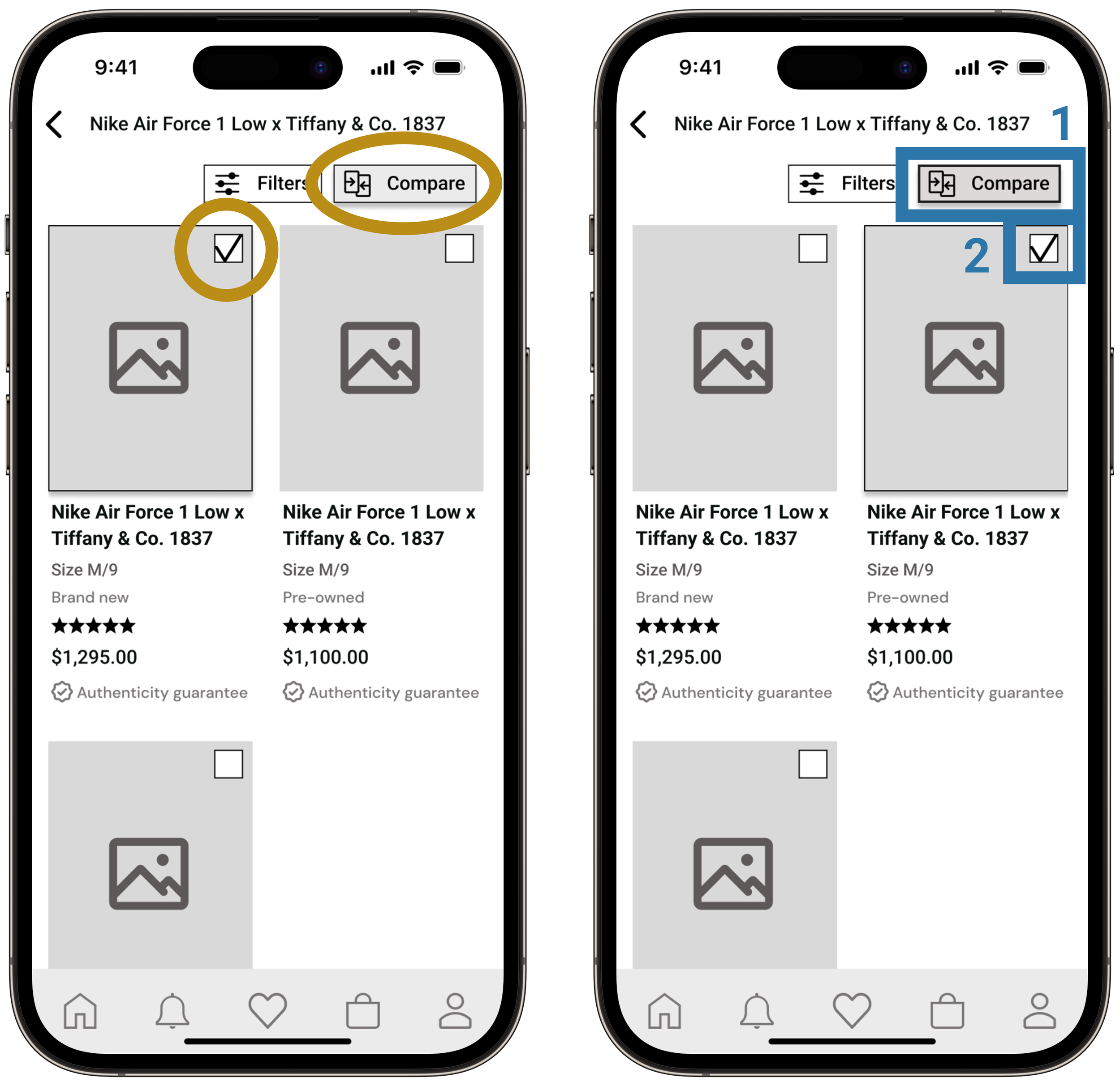
1- Added a darker gray and a thicker stroke to the "Compare" button, making it call user attention to this important app's feature.
2- Allowed the user to select items in any desirable order.
After (V2)
1- Replaced the "Search" icon with a full "Search Bar" on the "Sneakers" home screen, making this feature even more easy to be identified by users.
Before (V1)
After (V2)
1- Changed the position of the "Buy Now" button on the "Product Screen". Before, the user had to scroll down to find the button just after the product and seller information. Now, they can easily access this button at their convenience.
Session Output and
Prioritization Matrix
Round 2
After working on the necessary changes and with my prototype Version 2 ready, I conducted the second round of tests.
Once again, the results were consistent among all 5 tests: users found the app easy to use, straightforward, and with minor issues. The following is the most noteworthy issue mentioned across the tests:
Two users mentioned that they liked the information on the "Confirmation Screen", but they would like to see some highlighted details, making it more easily scannable.
Based on my session output, I worked on my Prioritization Matrix for round 2. Let's take a look:
Revisions - V2 x V3
Now, let's check the revisions made according to the Prioritization Matrix V2 x V3:
Before (V2)
After (V3)
1- Added "Order Number" at the top of the screen.
2- Highlighted some information to make it more easily scannable.
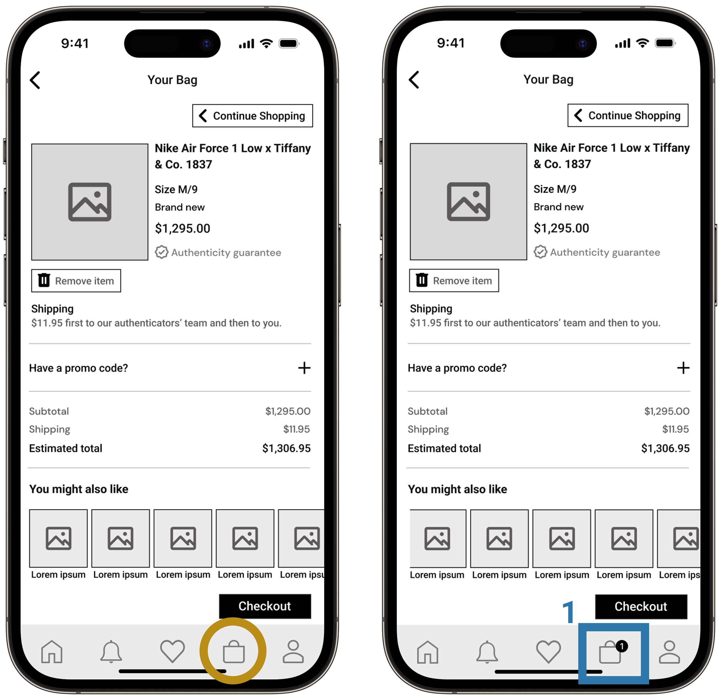
1- Added a number 1 on top of the "Shopping Bag" icon (navbar) to indicate that a product had been added to the shopping bag.
Before (V2)
After (V3)
Final Mid-Fi
Now, let's check my final Mid-Fi Prototype version:
-
1- General Home Screen - Here, the user lands after opening the app (already logged in). We can see the "Search Bar" at the top (allowing the user to search for a specific item, which is common in the secondhand market), followed by a scrollable list of categories. This list is not displayed in alphabetical order but in order of popularity.
2- Sneakers Home Screen - Home screen of the Sneakers section. We can see the "Search bar" at the centered top (allowing the user to search for a specific style, which is common in the secondhand market), followed by the "Hot Picks for You" section (based on items previously seen or bought). Finally, there's a scrollable list of categories organized by popularity.
3- Search Screen - User types "T" and then "i", and taps "Nike Air Force 1 Low x Tiffany & Co. 1837.
4- Search Results Screen - The user taps "Compare" and activates the feature. Then, the user selects both options in size M/9. The "Compare" button turns black and the user taps it again, entering the comparison mode.
5- Product Screen - A scrollable screen, designed to build users' trust. Here, they can find high-quality images, product and seller ratings, verified reviews, and complete product descriptions. The goal is to help the user learn everything they want about the product and also about the seller, so they can make an educated purchase, feeling confident about their choice.
6- Shopping Bag Screen - Here, the user can visualize an overview of the product(s) selected, as well as the information about the shipping costs, the option for adding a "Promo Code", an "estimated total" and a carousel of products that they might be interested in adding to their shopping bag before the checkout.
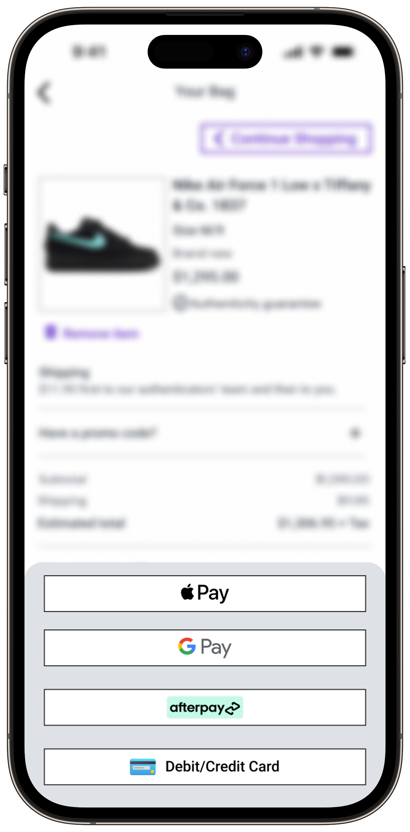
7- Payment process - Users can choose payment methods at their convenience, which enhances their experience when finishing the purchase.
8- Confirmation Screen - After proceeding to the checkout and completing the payment process, the user is taken to this screen, where they can see a summary of their order, as well as some information about the authentication process and shipping.
You can access the prototype here.
Brand Development
Brand Adjectives
After concluding the ideation phase, it was time for me to work on brand development, color injection, and UI Library.
I started the process by creating a list of adjectives I wanted my application to embody, also sorting them into related sections:
From that initial list, I chose the adjectives I believed could better express the feelings I wanted my users to have when using my application:
-
Trustworthy: the app is seen as a dependable source for genuine products, ensuring that purchases are authentic and as described.
Exclusive: Access to rare and sought-after items not widely available in the mainstream market.
Thrilling: The hunt for and acquisition of items is charged with excitement.
Empowering: Provides tools and information that enable users to make informed choices.
Connected: Fosters a sense of belonging among users with shared interests in luxury and fashion.
Passionate: Fuels the user’s passion for fashion and collecting exceptional items.
Vibrant: The app’s content and community are lively and dynamic, reflecting the energy of the secondhand market fashion world.
“More A than B” list
From my chosen adjectives, I created my "More A than B" list to better explore possibilities for my brand identity.
Let's take a look:
Photo Dump
I had established my main adjectives, so it was time to start working on my Mood Board.
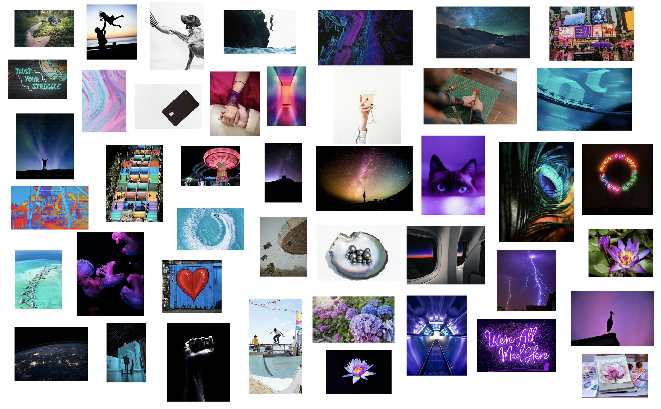
The first step was creating a Photo Dump of images that could represent the adjectives I identified, as we can see here:
You can access the file here.
Curated Mood Board
From my Photo Dump, I started working on my Curated Mood Board, narrowing the possibilities to get to a more focused idea of my brand.
As my adjectives highlighted, I wanted my users to have a thrilling and vibrant experience, knowing they can find exclusive hidden gems and trust this passionate online shopping experience in the secondhand market.
I wanted my users to feel connected and empowered during the process so they wouldn't have to worry about anything more than discovering amazing opportunities.
You can access the file here.
Brand Color Lab
With my curated Mood Board ready, it was time to start extracting colors that could represent my brand and enhance my users' experience.
I started with a broad color collection:
Probably broader than it should be:
But, finally, I was able to create some "color neighborhoods" that could better represent my brand:
After dedicating some time to thinking about my Persona's characteristics, my app's purpose, my brand adjectives, and all those images, I decided that "Rainbow" was my chosen color neighborhood.
You can access the file here.
Color Injection
It's important to say that, initially, checking my chosen color neighborhood, I was convinced I could combine two vivid colors in my design, working with two pops and a neutral. So I started testing different combinations.
-
1- It was the predominant color on my mood board.
2- According to color psychology, purple combines red's energy and blue's calm and can have both an energizing and relaxing effect. When used sparingly, purple can trigger feelings of joy or inspiration.
3- Purple is often associated with a sense of mystery, and wisdom - which are, somehow, two feelings that can be embodied in the secondhand market.
4- Also, because purple is so strongly associated with royalty, people often perceive it as being a very regal color - and, again, considering the purpose of my app, my persona's goals and motivations, and also my mood board, I understood that purple could represent this "exclusive" and "luxurious" feeling.
So I started some color exploration, following the 60-30-10 color method.
All accessibility testings were made using the Figma Plugin “Stark - Contrast & Accessibility Tools
And after all this testing process, I finally started injecting the colors into my screens.
I was, again, checking my mood board, and the chosen adjectives.
I was convinced this could be the perfect combination:
But as soon as I started, I noticed two things:
1- That purple shade was not taking my user experience to a "luxury", inspiring, thrilling experience. I had to calibrate it.
2- There was no space for my secondary color.
I realized my app was already going to have a lot of different colors coming from the products sold there, and I didn't want to create a "crazy vibe" for my users.
I wanted to keep my app with a clean, trustworthy, and exclusive vibe. I knew I had to take a step back and work with one pop and two neutrals. So my pivot was calibrating my purple and making a few more tests within my wireframes.
Let's check the testing process:
So I started testing the colors on my screens:
1st round:
Purple was too vivid for CTA buttons and too pale for other elements.
I started with the purple shade available in my neighborhood because that was the predominant color in my mood board.
However, it was clear that I had to play with the color saturation if I didn't want to overwhelm my users with vivid colors everywhere.
I chose a screen where I could see the color applied in CTAs and also in other details, contrasting with some product images.
2nd round:
Purple was looking better for CTA buttons but was still too pale for other elements.
3rd round:
Purple was better calibrated for CTA buttons and other elements.
So I tested my new purple shade also on a screen without CTA buttons but with more constant details and many different product images.
I was happy with the results because I believed this could enhance the user experience without having exhaustive color combinations.
I could see the brand presence, without subtracting trustworthiness.
So I decided to stick to my third round color option, working with a darker purple and its tints:
And considering my chosen cool tone, I established my neutral palette:
After choosing my brand color, I tested the interaction between the ones that could become my main tints, shades, and neutrals. The idea was to understand how the colors could work together to ensure reading accessibility.
Brand Name
I finally had a great overview of what my app had embodied, so it was time to brainstorm and pick a brand name.
I came up with a few ideas, always thinking about my Persona, my app purposes, the secondhand market itself my mood board, and my brand colors:
From this list, I selected my three favorite options, considering how they sound and their meaning:
Chosen Brand Name
After analyzing my possibilities, I decided to go with "HypeHunt".
It seems a good fit when I think about my Persona's needs, goals, and motivations: I want my users to experience the "hunt" in a thrilling, vibrant, and passionate way, knowing that they can rely on the app and its sellers, products, policies, community, and guarantees.
Brand Name Typography,
Wordmark and
App Icon
To start developing my wordmark I reached out to typography inspiration collecting logos from well-known brands that offer similar products to the ones sold in my app.
I felt this was the best way to understand what was currently working for my audience.
I started sketching ideas on paper, considering all the feelings I wanted to deliver with the brand name.
I allowed myself to sketch ideas even for names that were only on my first list because I wanted this creative process to be totally open to possibilities:
Here, I was playing with different weights, and shapes, and also with the idea of connecting two "Hs" creating "cat ears"- to bring the "hunt" vibe.
Here, I was really trying to connect the "y" (from "Hype") to the "H" (from "Hunt")
I tried to take my ideas to Figma and use the Pen Tool, but when I realized I was already manipulating different Fonts from the application.
First, I created a wordmark using the font PilGi Regular 16, coming from my idea of connecting the "y" (from "Hype") to the "H" (from "Hunt"). I tried my favorite option in black and white, white and black.
I wanted to add a diamond, to represent the "gems" that my users can find in the secondhand market app.
Here, we can see how the brand name was with the Font without any manipulation:
And here, we can see how it became after I connected letters and placed the words on different levels:
But the truth is that this Font was leading me to a place where I could no longer connect with my Typography inspiration. So, even though I liked the results of this first process, I started sketching a second option.
I knew I'd decided to develop my app with only 90° corners, so I wanted my Typeface to represent this choice.
I was looking for a Typeface that could give me the "powerful", "exclusive", and "straightforward" vibe.
I decided to go with "Copperplate Regular", and this was the process:
I kept the little diamond representing the brand color (and its proportional application to the design) and representing the "gems" of the secondhand market as well. I tested it in different positions, considering the already discussed meanings of the brand name and the purple color.
I developed the black and the white versions of my chosen wordmark.
I manipulated the Letter Spacing: -5% between all the letters and 10% between the words "Hype" and "Hunt" that were written together.
And I finally chose my wordmark
Considering that I was designing for iOS, I came up with two options for my "iOS App Icon".
I wanted it to be remarkable, have an "exclusive" vibe, and represent the color proportions existing in my app.
*The app icon doesn’t have a black stroke, but I'm using it to highlight the shape of it here.
High-Fidelity Prototype
With everything ready, I finished my high-fidelity prototype.
You can access the prototype here.
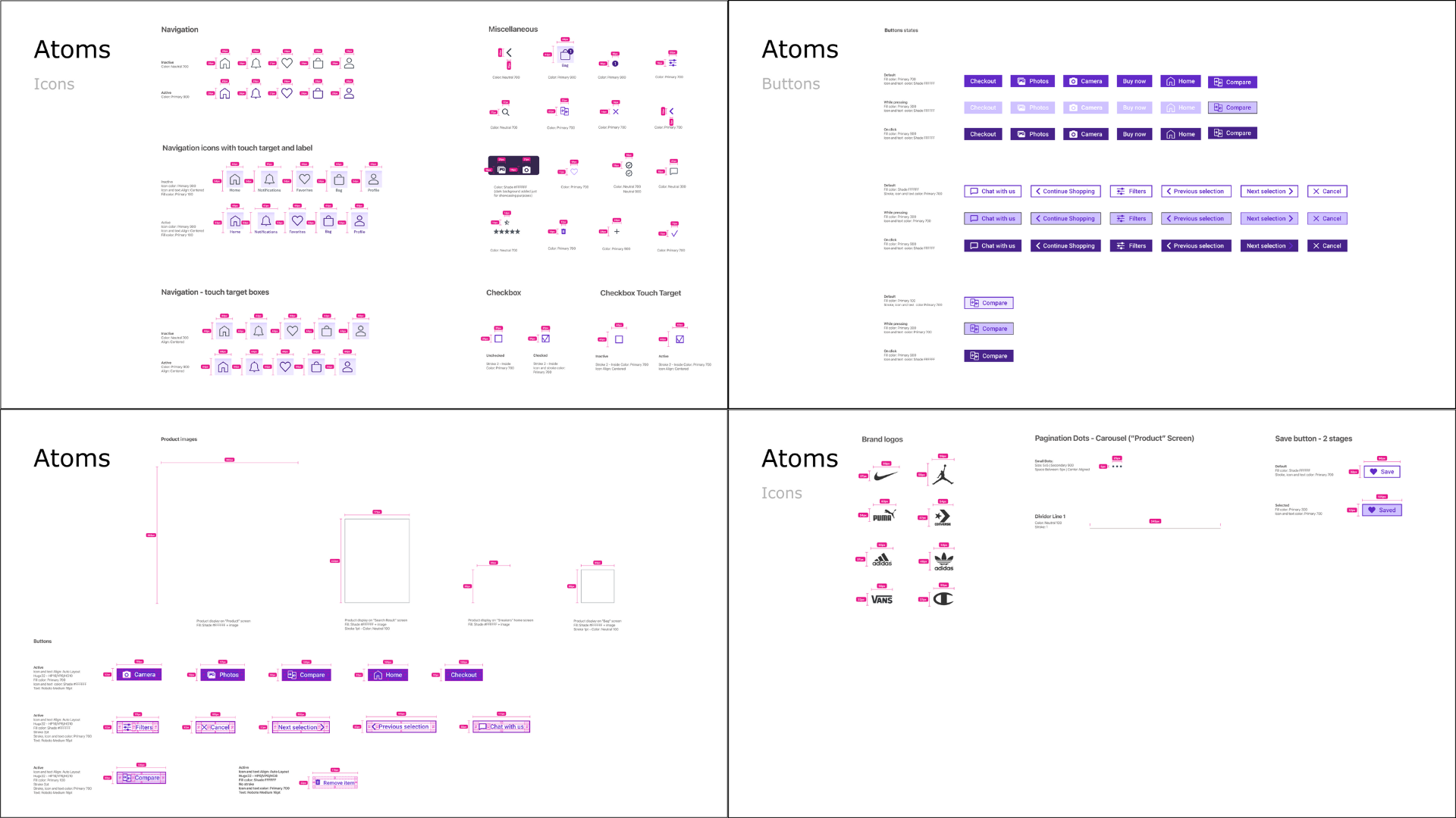
UI Library
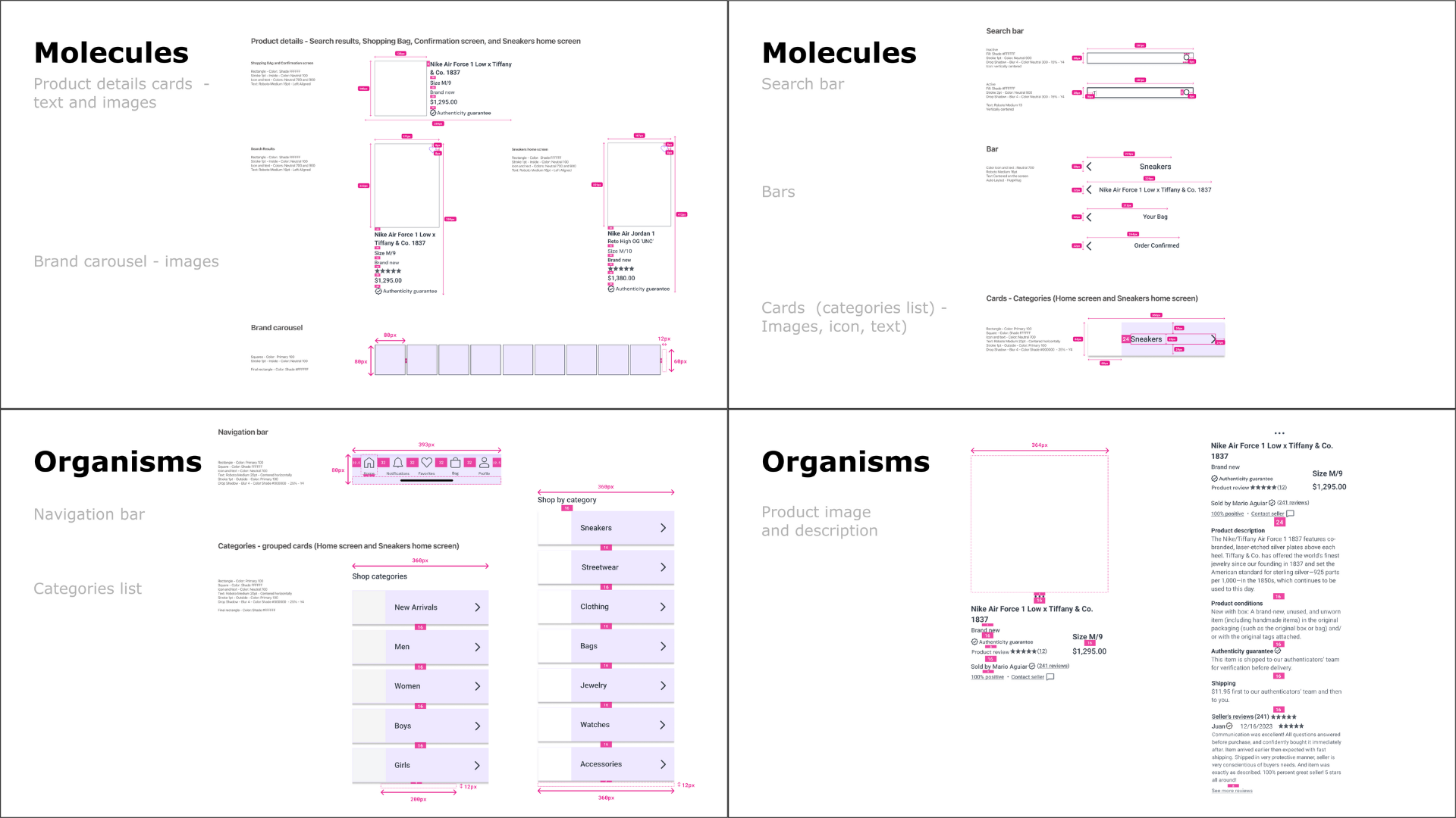
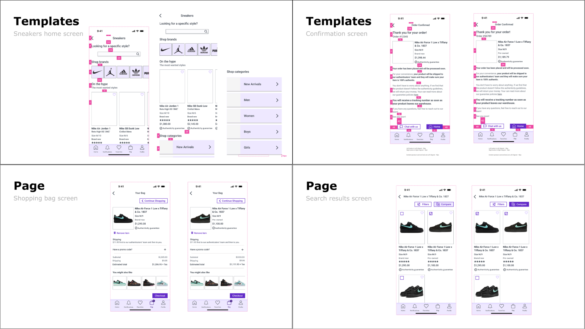
Throughout developing HypeHunt, I built and maintained a User Interface library that contains all the elements used in my app.
I precisely cataloged and organized all design elements, redlined specifications for measurements, and highlighted spacing for all components in my design.
-
Atomic design is the methodology I used to create and break down my app design system, by categorizing my screens and features as the following atomic design elements:
• Atomic( Foundations) - Text Style, colors, icons, shadows, grids and spacing, buttons, & labels, illustrations
• Molecules (Components) - Input boxes, text fields, search boxes
• Organisms (Patterns) - Navigation Bar, widgets, topic & profile cards
•Templates - Modals
•Pages - Specialized Screens
Marketing Website
With my High-Fidelity prototype ready, it was time to develop my Marketing Website.
-
A marketing website is an essential platform for showcasing my app, which means it is a space where my app's unique value proposition and features are highlighted in detail.
In essence, a marketing website serves as a pivotal tool in the app promotion ecosystem, enhancing visibility, fostering user engagement, and ultimately driving downloads. This approach underscores the importance of a well-crafted digital strategy in the competitive app market.
My goal was to promote the HypeHunt app, focusing on my primary demographic target audience, according to my research and defining phase: Millennials.
UI Inspiration Board and
Extended Mood Board
I collected inspiration for UI elements and components that make up a product marketing website (Top Navbar, Hero Section, Features Section, Endorsements, Social Proof, Footer, and Badges), keeping in mind that my main objective was to collect the ones that I thought would help potential users better understand why HypeHunt can be aggregate value to their lives.
With my UI Inspiration Boards ready, I revisited my Mood Board and expanded it with a few more images.
I took a minute to revisit my Persona, the adjectives collected to represent my brand, and everything else that was part of the understanding process of the product I developed.
You can access the file here.
Because I had a very intense "branding" process - going over my Persona, my prototype, my adjectives, and my Mood Board exhaustively - I didn't feel I had to change so many things at this point.
I believe the chosen colors well represent the brand and promote a not-overwhelming online experience, giving the necessary space for the products sold within the app to be in the spotlight.
So I decided to keep the same color palette when developing my Marketing Website.
Ideating and Prototyping
I had my UI Inspiration Boards and my Expanded Mood Board, so it was time to start sketching.
I sketched 3 variations for both desktop and mobile Marketing Websites.
The idea was to experience different approaches, understand what could enhance the user experience, and maximize the conversion of users to my app.
The following step in my design process was to create Mid-Fi prototypes based on the solutions sketches and turn them into my Hi-Fi Prototypes Version 1. Below, we can see them side by side:
Peer Critique and
Prioritization Matrix
The next step of this design process was a Peer Critique.
I had the opportunity to share my Hi-Fi wireframes with some peers in this session, and I gathered some feedback for both desktop and mobile versions that I organized in a Prioritization Matrix, as we can see here:
High-Fidelity Prototype
I made the necessary changes according to the Prioritization Matrix and got to my Hi-Fi Prototype for both Desktop and Mobile designs. Let's see the results:
You can access the Marketing Website Hi-Fi Prototype - Mobile Version here.
You can access the Marketing Website Hi-Fi Prototype - Desktop Version here.
Diagram Content Flow
To ensure that my Marketing Website is responsive on different devices, I created and followed a Content Flow Diagram for both desktop and mobile designs. Let's see the results:
Multi Platform Challenge
I decided to go one step further.
Was there something else that I could offer my Persona, maybe tackling a different need or a different scenario in his routine that could improve his experience with HypeHunt as a brand and not only as a mobile app?
I started mapping by checking my Experience Map. I wanted to understand new or different opportunities for intervention.
Alex, my Persona, is a Web Developer, which means he spends a lot of time working on his computer. So maybe HypeHunt could be easier accessed during his work hours through a Website.
So that was my answer. I understood I didn't have to change things previously done, I just had to allow Alex to navigate the secondhand market by accessing HypeHunt through a different platform: his computer.
I had everything related to my brand ready, so it was time to collect some UI Inspiration for the website. From there, I worked on my wireframes and prototype. Let's check the result:
Future Thinking
I understand the importance of thinking about my product by looking at its origins, but also trying to reflect on the future.
So I decided to use the “Tarot Cards of Tech". This was my card:
You can check the “Tarot Cards of Tech” here.
Let's check my reflections:
-
When 100 million people use my app, it transforms into a key player in the secondhand market, significantly impacting consumer behavior towards sustainability and affordability. This massive user base would help cut down on waste by encouraging the reuse of items. The app's trustworthy and vibrant user experience might become the benchmark for customer expectations in online secondhand shopping, promoting the choice of used items over new across a variety of products.
-
Mass-scale usage of my product would highlight the enormous growth potential in the secondhand market. It might prompt major retailers and brands to rethink their production and sales strategies, potentially leading to more sustainability-focused collaborations. Economically, it could lead to more competitive pricing and improved quality control in the secondhand market as sellers strive to meet the high standards my platform sets. It could also uncover logistical challenges, necessitating robust solutions to manage the increased flow of goods.
-
If 80% of the community used my app, we could see a shift towards a more circular economy where the buying and selling of secondhand items become a community norm. This might strengthen local marketplaces, reducing the carbon footprint from shipping items over long distances. Community ties could deepen as residents increasingly engage with each other through my platform, supporting local sellers and buyers. It could also inspire local events like swap meets or community markets, further promoting sustainable consumer habits.
-
Habits and norms around shopping and ownership could dramatically shift with the widespread use of my app. People may start routinely considering secondhand goods first, recognizing their sustainability and economic advantages over new products. The norm might evolve towards more thoughtful consumption patterns, where the lifecycle of products is extended through reuse and resale. The thrill of hunting for unique and exclusive items on my platform could supplant the appeal of fast fashion, potentially reducing demand for mass-produced goods and encouraging more investment in quality and uniqueness.
It's awesome to think that my app has so many opportunities for improvement that can benefit my Persona, other users, the community, the environment, and much more.
Key Learnings
This design process was an amazing journey. I learned a lot and I'd love to share a few key learnings with you:
-
1- Clarity and Efficiency: Organization keeps the design process clear and efficient. It ensures that every team member understands their tasks and deadlines, helping the project stay on track and within budget.
2-Improves Collaboration: Being organized helps teams communicate better and work together more effectively. This includes keeping Figma files and other resources well-organized, so everyone can find and use them when needed, avoiding delays and confusion.
3- Quality Control: A structured process with organized reviews and checks ensures high-quality outcomes. This includes maintaining orderly records in Figma files and other documentation, making it easier to review past decisions and apply improvements.
-
1- Understanding User Needs: Empathy helps designers really get what users need and want. This makes sure the solutions created are useful and appropriate for the people who will use them.
2- Building Connections: By empathizing, designers connect better with users, gaining their trust and getting more honest feedback.
3- Finding Hidden Needs: Sometimes users have needs they don't even know about. Empathy lets designers discover these hidden needs, leading to more innovative solutions.
4- Focusing on People: Empathy keeps the design focused on improving things for real people, rather than just pushing technology or making money.
5- Avoiding Bias: It helps designers avoid their own biases and see things from the user's perspective, which leads to better designs.
6- Encouraging Teamwork: When empathy is part of the process, everyone is more open to different ideas, which helps the whole team come up with better solutions.
-
1- Validating Ideas: Testing allows designers to validate their ideas against real user experiences. This helps confirm whether the design meets the needs it's supposed to, ensuring the product will be useful in real-world scenarios.
2- Identifying Problems Early: By testing early and often, problems can be spotted before the design is finalized. This saves time and resources by preventing costly revisions after the product launch.
3- Refining User Experience: Testing provides critical feedback that helps refine the user experience. Designers can adjust interfaces, workflows, and interactions based on actual user responses, leading to a more intuitive and effective product.
-
1- Fostering Creativity: Ambiguity allows designers to explore a wide range of possibilities without being constrained by predefined outcomes. This openness can lead to more creative and innovative solutions.
2- Adapting to Change: In the design world, requirements and goals often change as projects evolve. Being comfortable with ambiguity helps designers remain flexible and responsive to new information and changing needs.
3- Encouraging Exploration: Embracing uncertainty encourages deeper exploration of problems and solutions. Designers who are comfortable with not having all the answers are more likely to discover unique insights and transformative ideas.
Next Steps
This phase of the process is coming to an end, but that doesn't mean I haven't thought about the future. I will continue developing and improving my skills, and I will work hard to take HypeHunt to another level.
Now, let me share my immediate next steps with you:
1- Iterate and Retest Prototype: I plan to refine my high-fidelity prototype based on the feedback received and conduct another round of user testing. This will ensure the improvements effectively meet user needs.
2- Develop New Features: I intend to design new features that align with the needs identified in my user stories, aiming to enhance functionality and user satisfaction.
3- Explore Partnerships: I will identify and explore potential partnerships that could expand the reach and impact of my projects.
4- Increase Accessibility: I am committed to enhancing the accessibility of my designs to ensure they are usable by people with a wide range of abilities and in various environments.


