Marketing Website
Project Overview
To address the challenges of secondhand market online shopping, I designed HypeHunt, an iOS app that delivers the necessary information to build users’ trust and peace of mind, offering them reliable sellers and authentic products.
HypeHunt provides users with high-quality images and detailed product descriptions, verified reviews of products and resellers, and a two-step authentication process - everything handy in a compassion feature, carefully thought to create a trustworthy secondhand market platform.
With my High-Fidelity prototype ready, it was time to develop my Marketing Website. In essence, a marketing website serves as a pivotal tool in the app promotion ecosystem, enhancing visibility, fostering user engagement, and ultimately driving downloads. This approach underscores the importance of a well-crafted digital strategy in the competitive app market.
My goal was to promote the HypeHunt app, focusing on my primary demographic target audience, according to my research and defining phase: Millennials.
Project Length: 5 days
My role: End-to-end UX/UI Designer
Tools Used: Figma, FigJam, Slack, Google Meet
OS: iOS and MacOS
Methodology
For this design challenge, I adopted the non-linear Design Thinking Process, placing the end-user at the heart of all decisions. This approach helps tackle complex, undefined problems with the ultimate goal of creating a solution that fits the users’ needs, developing usable, useful, enjoyable, and equitable solutions.
UI Inspiration Board and Extended Mood Board
I collected inspiration for UI elements and components that make up a product marketing website (Top Navbar, Hero Section, Features Section, Endorsements, Social Proof, Footer, and Badges), keeping in mind that my main objective was to collect the ones that I thought would help potential users better understand why HypeHunt can be aggregate value to their lives.
With my UI Inspiration Boards ready, I revisited my Mood Board and expanded it with a few more images.
I took a minute to revisit my Persona, the adjectives collected to represent my brand, and everything else that was part of the understanding process of the product I developed.
Because I had a very intense "branding" process - going over my Persona, my prototype, my adjectives, and my Mood Board exhaustively - I didn't feel I had to change so many things at this point.
I believe the chosen colors well represent the brand and promote a not-overwhelming online experience, giving the necessary space for the products sold within the app to be in the spotlight.
So I decided to keep the same color palette when developing my Marketing Website.
Ideating and Prototyping
I had my UI Inspiration Boards and my Expanded Mood Board, so it was time to start sketching.
I sketched 3 variations for both desktop and mobile Marketing Websites.
The idea was to experience different approaches, understand what could enhance the user experience, and maximize the conversion of users to my app.
From my Exploratory Sketches, I got to my Solution Sketches:
Desktop
Desktop - Mid-Fi Prototype
Desktop - Hi-Fi Prototype Version 1
Mobile
The following step in my design process was to create Mid-Fi prototypes based on the solutions sketches and turn them into my Hi-Fi Prototypes Version 1. Below, we can see them side by side:
Mobile - Mid-Fi Prototype
Mobile - Hi-Fi Prototype Version 1
Peer Critique and
Prioritization Matrix
The following step of this design process was a Peer Critique.
I had the opportunity to share my Hi-Fi wireframes with some peers in a session, and I gathered some feedback for both desktop and mobile versions that I organized in a Prioritization Matrix, as we can see here:
Revisions
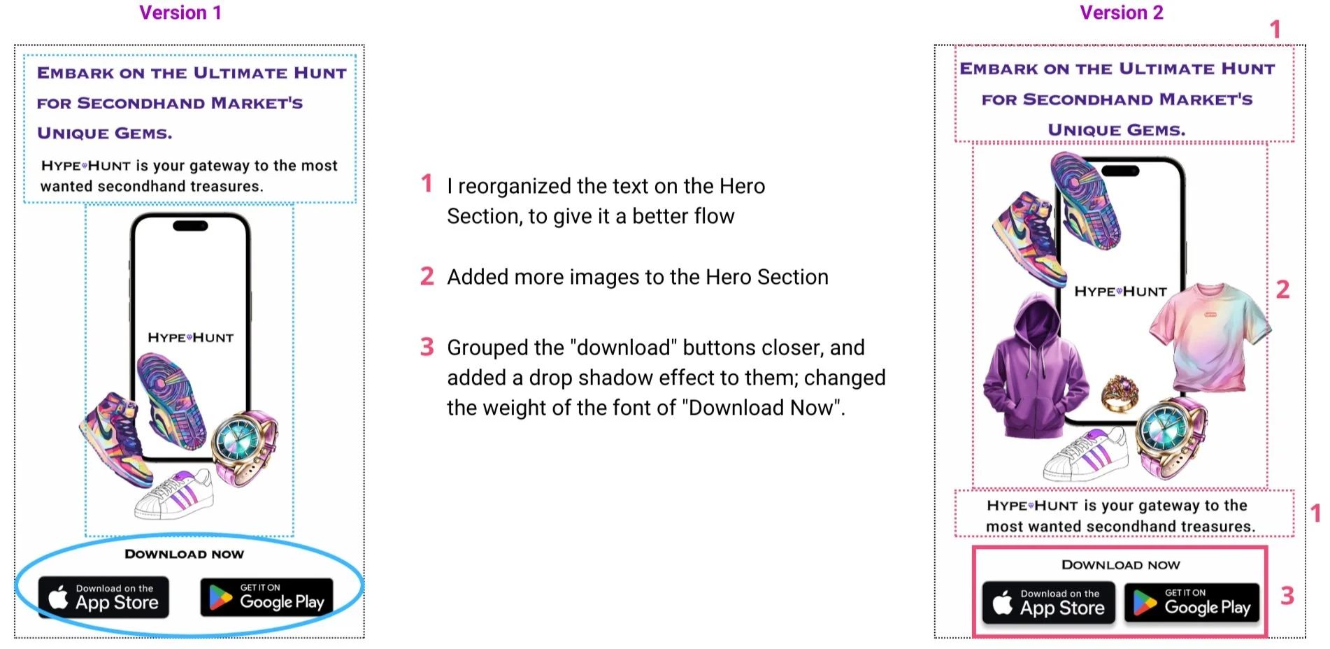
Based on my Prioritization Matrix, I polished my Desktop and Mobile High-Fidelity prototypes.
Below, we can see the comparison between the versions:
Desktop revisions:
Mobile revisions:
High-Fidelity Prototype
I made the necessary changes according to the Prioritization Matrix and got to my Hi-Fi Prototype for both Desktop and Mobile designs. My Marketing Website was finally ready to promote the HypeHunt app.
Let's check the results:
You can access the Marketing Website Hi-Fi Prototype - Mobile Version here.
You can access the Marketing Website Hi-Fi Prototype - Desktop Version here.
Diagram Content Flow
Furthermore, I created and followed a Content Flow Diagram for both desktop and mobile designs to ensure that my Marketing Website is responsive on different devices. Let's see the results:
Key Learnings
Throughout this project, a few key learnings stood out:
Consistency Across Devices: I ensured a seamless user experience across both desktop and mobile platforms. Consistent design elements and functionality build trust and familiarity, allowing users to navigate the website effortlessly regardless of the device they are using.
User-Centric Design: I understood the needs and behaviors of my target audience. By prioritizing user research and feedback, I designed a website that effectively addresses user pain points and enhances their overall experience, leading to higher engagement and satisfaction.
Clear Communication of Value Proposition: I clearly conveyed the unique benefits and features of HypeHunt. Through concise messaging, engaging visuals, and strategic content placement, I effectively communicated the app's value, building trust and encouraging potential users to download and use the app.
Strategic Section Placement: I thoughtfully organized different sections—such as the hero section, features section, testimonials, footer, and navigation bar—to guide users through the website. Each section has a clear purpose and was strategically placed to maximize user engagement and conversion, so HypeHunt can grow and impact more users.
Next Steps
1- Conduct Diverse User Testing: Implement more comprehensive user testing with diverse users to gather a wider range of feedback. This will help me identify any additional pain points and areas for improvement, ensuring the website meets the needs of all potential users.
2- Optimize for Accessibility: Ensure the website is fully accessible to users with disabilities by adhering to WCAG (Web Content Accessibility Guidelines) standards. This includes optimizing for screen readers, providing alternative text for images, and ensuring keyboard navigability.
3- Strengthen Social Media Integration: Enhance the integration of social media channels to increase user engagement and drive traffic to the website. This step of my design can include adding social sharing buttons, embedding live feeds, and encouraging user-generated content.


