

Design Sprint
Project Overview
For this project, three other UX Designers and I have been tasked to complete a 5-day Design Sprint to tackle the proposed challenge of building a high-fidelity prototype for an NGO or NPO, focusing on optimizing their current website to increase donor engagement and highlighting their value proposition. For our pitch, we had to present to a board of directors, showcasing our sprint’s key research findings, a compelling design solution, as well as our project’s next steps.
We evaluated existing non-profit organizations' websites by analyzing their usability, focusing on what they offered that could work better and what was missing that we could provide, always trying to identify opportunities to enhance their users’ experience and increase donor engagement. We wanted to understand the main difficulties that users were facing when trying to donate to an NPO - specifically to one called “The CLEO Institute”, located in Florida, which was our chosen organization.
Our goal was to increase donations to “The CLEO Institute” to fund their climate crisis education and advocacy.
-
![]()
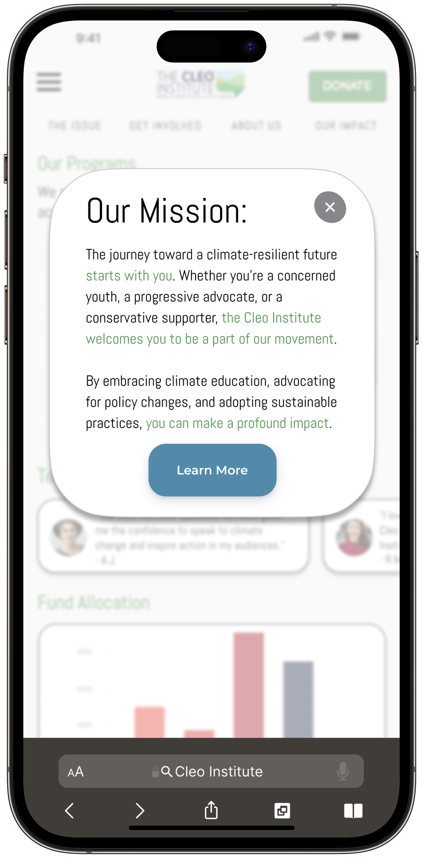
Welcoming Message - Value Proposition
-
![]()
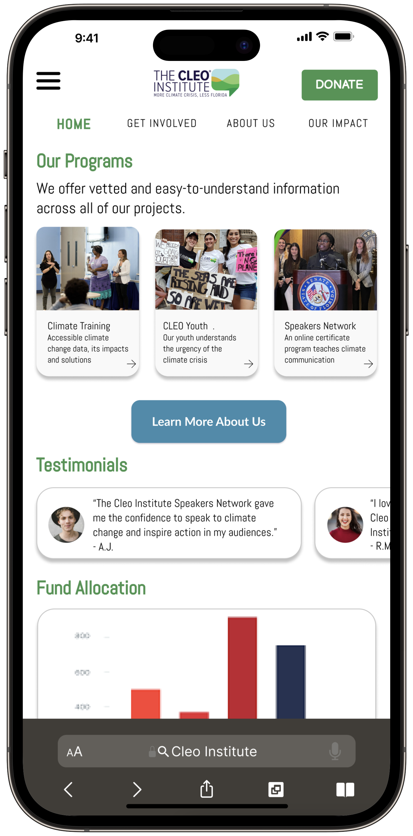
Home
-
![]()
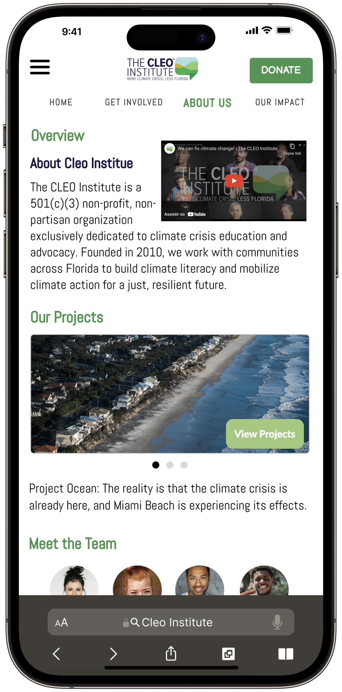
About Us
-
![]()
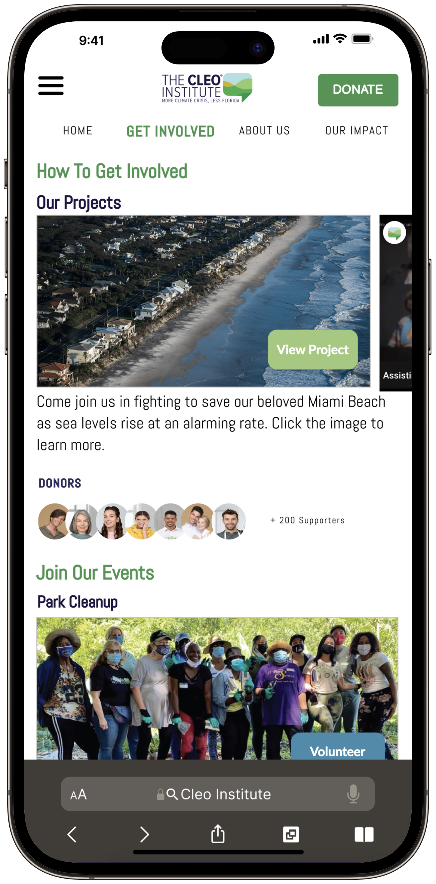
Get Involved
-
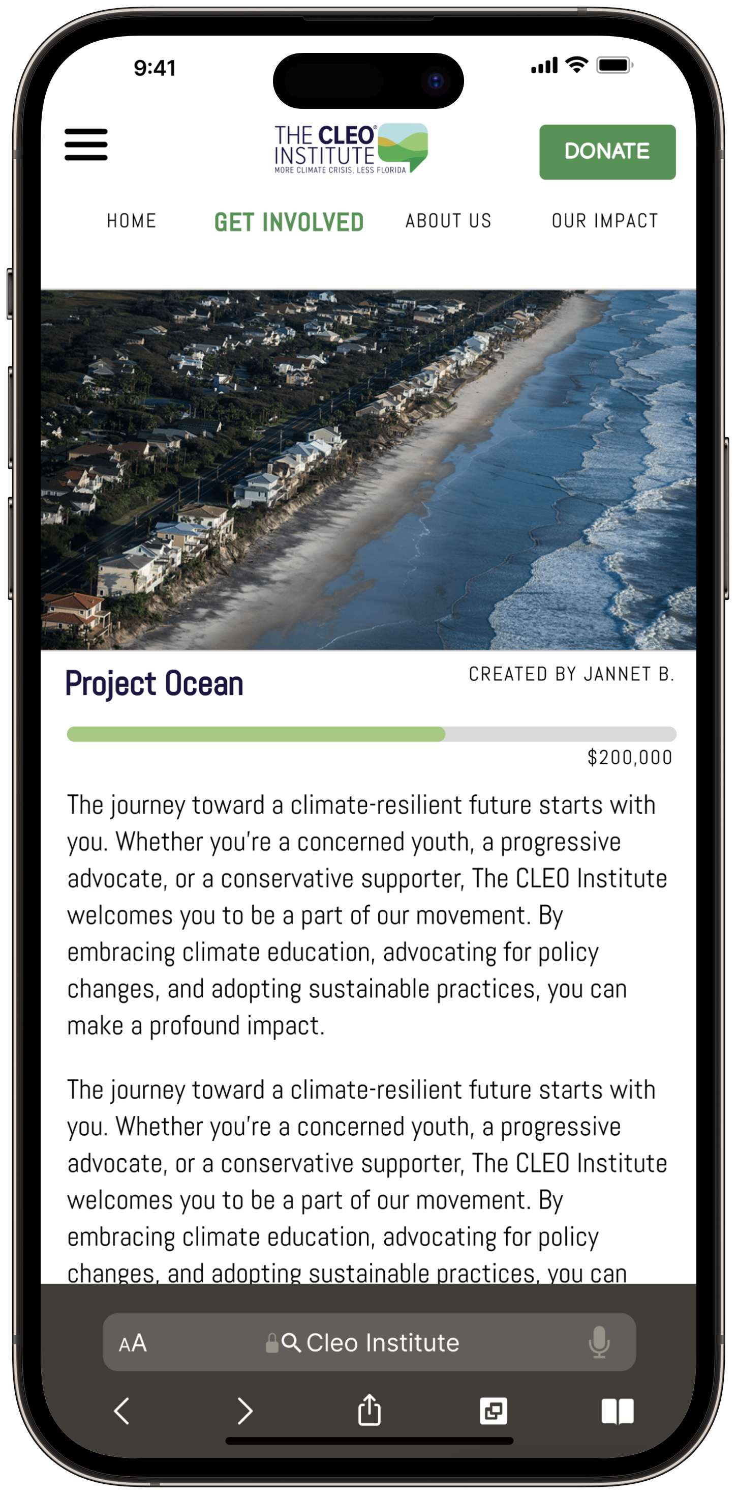
![]()
Project Ocean
-
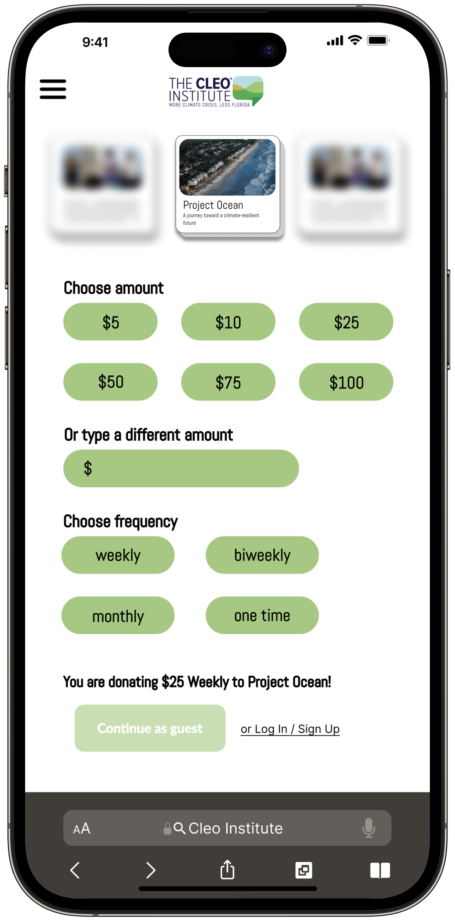
![]()
Donation Options
-
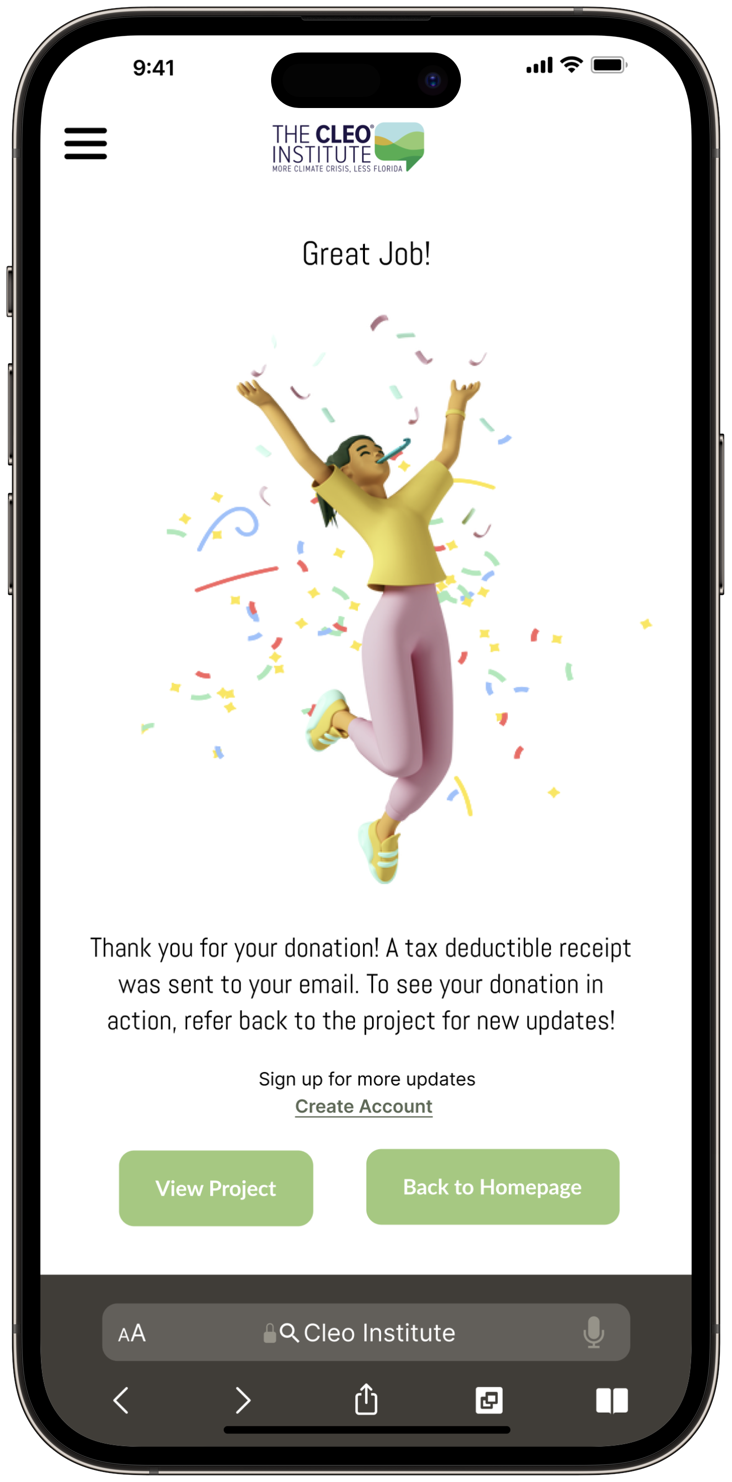
![]()
Confirmation
Project Length: 5 days
My role: End-to-end UX/UI Designer
Tools Used: Figma, FigJam, Slack, Zoom
OS: iOS
Team members: Jaswinder Kaur, Ashley Peterson, Alyssia Angeles
Methodology
For this design challenge, my team adopted the non-linear Design Thinking Process, placing the end-user at the heart of all decisions. This approach helps tackle complex, undefined problems with the ultimate goal of creating a solution that fits the users’ needs, developing usable, useful, enjoyable, and equitable solutions.

Problem Space
Since every integrant of our group was from a different place, we decided to check different causes, NGOs, NPOs, websites, and apps, to choose an area, an organization, and our target audience.
We collected a few different options, discussed their impacts, identified causes that could impact more people, organized our activities considering our time frame, and decided to work with an NPO called. “The CLEO Institute", located in Florida.
So we stuck to the following Problem Space: In Florida Nonprofit Alliance’s 2022 research, Giving in Florida, Florida donors tell us one of the top reasons they stop giving to nonprofit organizations is because the organizations are mismanaging financial resources and spending too much on administration and fundraising expenses, which causes trust issues.
Secondary Research
Our team believed it was important to conduct secondary research to better understand why Floridians are, apparently, unhappy with some situations that stop them from giving to non-profits. Let's check what we've found out:

Existing Website Analysis
Knowing why users are struggling when building their trust around NPOs, we decided to check “The CLEO Institute” existing website to identify points that could be improved to build users trust during the donation process.

We took a moment to reflect on a few things.
What is working? What would work on iOS?
- Accessibility: translate option to Spanish or Haitian Creole
- A good element is “Follow us on social media” at the very top. Also, engaging content (video) above the fold line
- Working design components: color, contract, fonts
- Mobile: the “hamburger menu” is large and at the top right
What could be improved?
- Desktop: "Power Climate Action” button - it is not clear that this button takes the user to a donation page
- Mobile: “Donate Now” button is at the very bottom, reducing the conversion
- Disclosure: the website has a lot of sections, but it looks overwhelming instead of informative
- Financial reports: fund allocation is not showcased in a way that users’ needs for “trust and transparency” are treated as a priority, compromising their reliability
- Navigation: The hamburger menu presents an extensive list that does not facilitates users’ navigation
Preliminary HWM
After conducting our secondary research, we established our Preliminary HMW question to guide us through the next steps of the process:

Assumptions
Each team member wrote a few assumptions related to the topic, considering the data and the Preliminary HWM that we had at the moment. Then, we turned our assumptions into questions. Let's check the process:
Assumptions:
1- I believe people want to easily understand the main goal/destination of their donation.
2- I believe people are not aware of climate change risks.
3- I believe there's not enough disclosure about NPOs, so people don't get engaged and don't donate money.
4- I believe people want to contribute to NPOs, but they don't know how (which organizations, where they are located, what are their goals).
5- I believe people want to be exposed to clear and concise donation processes.
Questions:
1- How can I donate?
2- What is the cause?
3- Where is my money going?
4- When can I see these positive impacts?
5- How can I help my community?
6- Why do people want to donate to climate change?
7- How does climate change affect me?
Primary Research
We had the data and the Preliminary HWM guiding our path, so it was time for us to dig deeper and hear from potential users: what are their goals and motivations, pain points, and behaviors when it comes to donating to an NPO using their website?
We conducted three interviews, worked on our Affinity Mapping, and identified common Themes. We evaluated these Themes, the secondary research, and “The CLEO Institute” website, deciding to work with theme number 2:

Revised HMW
As a team of Designers focused on enhancing our users' experience, we analyzed all the information we had collected and understood one important fact: The issue is not that users aren’t willing to donate. The issue is users lack trust and transparency when donating, and they need to know where their money is really being used.
Knowing this, we revised our HMW question, which came to be:

Persona
This empathetic process brought our persona alive. Let's meet Jessica Torres.

UI Inspiration Board

We learned about "The CLEO Institute” existing website, and about our users, their pain points, behaviors, goals and motivations. So each member of our team took a moment to collect elements for our UI Inspiration Board, looking for options that could improve our users’ experience and build their trust while donating to the organization.
Solution Sketches
We had our UI Inspiration Board full of ideas that could improve our users’ experience.
So each member of our team sketched 2-3 variations of each page we understood was important to be shown on our mobile website prototype (Landing page, Home page, About Us, Projects, Project Ocean, Payment, Confirmation) and presented the ideas for the team.
We voted, discussed the ones we understood to be the best solutions for our users, and came up with our Solution Sketches, which we can see here:

Mid-fi Wireframes
Since the first meeting we had, our group had decided that every team member would be an end-to-end UX Designer. In every step of the process, we kept that goal and got everyone involved. Each UX Designer knew they could have a more proactive approach to things that they were more familiar with, but everyone wanted to participate in every single activity.
It wasn't different during the development of our Mid-fi Wireframes. We had a few “all hands on" sessions on Figma while we were in Slack huddles, always discussing ideas, design, development, functionality, and every other detail that was important to our project, taking into account the different background and perspectives of each member that could positively impact and lead us towards our main goal.
We established our Typography and our Grayscale considering the existing website.
Now, let's check the results:

Usability Testing Plan,
Sessions Output, and
Prioritization Evaluation
Wireframes ready, it was time to set up the prototype and prepare the Usability Testing Plan. Our goal was to understand how users would complete the tasks when using the designed application.
Knowing the importance of improving the app's design to enhance the user experience, we conducted 3 user tests. Each one of the sessions took place on "Google Meeting" and lasted between 15 and 20 minutes.
We asked our users to complete 5 different tasks:
1- Find out more about who and what the Cleo Institute is about
2- Learn more about the current projects
3- Read more about Project Ocean
4- Donate to that cause ($25/weekly)
5- Enter Payment Details and Submit
Let's check the Sessions Output:

Testers said the task flow was logical, straightforward, and easy to navigate. They appreciated information about individual projects and the non-profit validation in the footer. They also provided insights on adding more options and context.
Only ⅓ testers struggled slightly but they were able to recover smoothly and quickly through the tasks given. Overall, we had positive feedback as our design provided a transparent and trustworthy output.
We evaluated the results and prioritized the changes that could best provide a better experience for our users:
1- We improved the flow from “About Us” to “Get Involved”, so the user would navigate to “Our Projects” more naturally
2- We changed the payment from a long-form card entry to Apple Pay
3- We gave the user the option to easily revisit the project they just donated towards
Final Prototype
We made the necessary changes according to the Prioritization Evaluation and got to our Hi-Fi Prototype. Our mobile website was finally ready to optimize “The CLEO Institue” current website experience, increasing donor engagement and highlighting its value proposition.
Let's check the final result:
Key Learnings
Throughout the sprint, a few key learnings stood out:


1- Effective Team Communication: The success of our design sprint relied heavily on clear, consistent communication within the team. By establishing open channels for regular discussions and feedback, we ensured that every team member was aligned with the project goals and aware of each other's contributions and challenges. This facilitated a collaborative environment where ideas could be shared freely and integrated seamlessly into our design process. Effective communication also helped in mitigating misunderstandings and efficiently addressing any issues that arose, ensuring a smoother workflow and more coherent design outcomes. This practice not only enhanced our internal team dynamics but also reflected positively in the clarity and effectiveness of the external user interfaces we designed.
2- User-Centric Approach: Emphasizing user needs helped in identifying critical usability issues that might not have been apparent from an internal perspective alone.
3- Collaborative Expertise: Leveraging the distinct skills and insights of each team member enriched the quality of our analysis and the breadth of our design solutions.
4- Iterative Testing: Continuous user testing allowed us to refine our designs promptly and align more closely with user expectations and preferences.
5- Information Clarity: Redesigning the information architecture to enhance clarity and transparency proved essential in making the donation process more intuitive and accessible.
With the implementation of the improved design elements, we anticipate that “The CLEO Institute” will experience increased site engagement and a rise in donations, driven by a clearer information hierarchy and an easier donation process. This aligns with our commitment to enhancing the impact and reach of non-profit organizations through thoughtful and effective UX design.
Next Steps
Our team took a moment to walk through all the steps from our Design Sprint project and understood that if we were given one more week to work on our mobile website prototype, we would:

1- Stitch all aspects for optimal user navigation
2- Include functional carousels for viewing testimonials and projects
3- Create a “User Account”
4- Include real-time donation totals
5- Amplify opportunities for alternate donation types: goods and/or services
